
Allan Gardens Wayfinding
Project Details
A wayfinding system designed to guide visitors from the Allan Gardens parking lot into the historic conservatory. The project addressed navigation challenges caused by confusing signage, multiple entrances, and a disconnection between the parking area and the conservatory's main entrance.
Through site observations, journey mapping, and visitor research, I designed a cohesive signage system that prioritizes clarity, accessibility, and environmental integration while respecting the site's heritage character.
Context / Brief
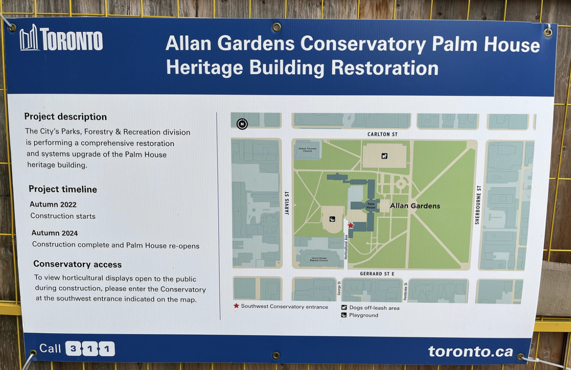
Allan Gardens is a historic conservatory in downtown Toronto. Visitors arriving by car must navigate from the parking lot entrance on Jarvis Street to the conservatory entrance on Horticultural Avenue—a journey that is currently confusing and poorly signed, leading to frustration and missed visits.
Challenge
Visitors often enter through the wrong gate, miss directional cues, or give up entirely due to unclear wayfinding. The site has multiple entrances, no visible signage from the parking lot, and environmental barriers (fencing, pathways) that obscure the correct route. The challenge was to design a signage system that works within heritage site constraints while improving visitor confidence and circulation.
Goal
Design a clear, accessible wayfinding system that guides visitors from the parking lot entrance to the conservatory main entrance, reducing confusion and improving the arrival experience.
Deliverables
- Site analysis and journey mapping
- Signage system with directional, informational, and identificational signs
- Visual identity for signage (typography, iconography, color)
- Placement recommendations and mockups
Site observations & opportunity
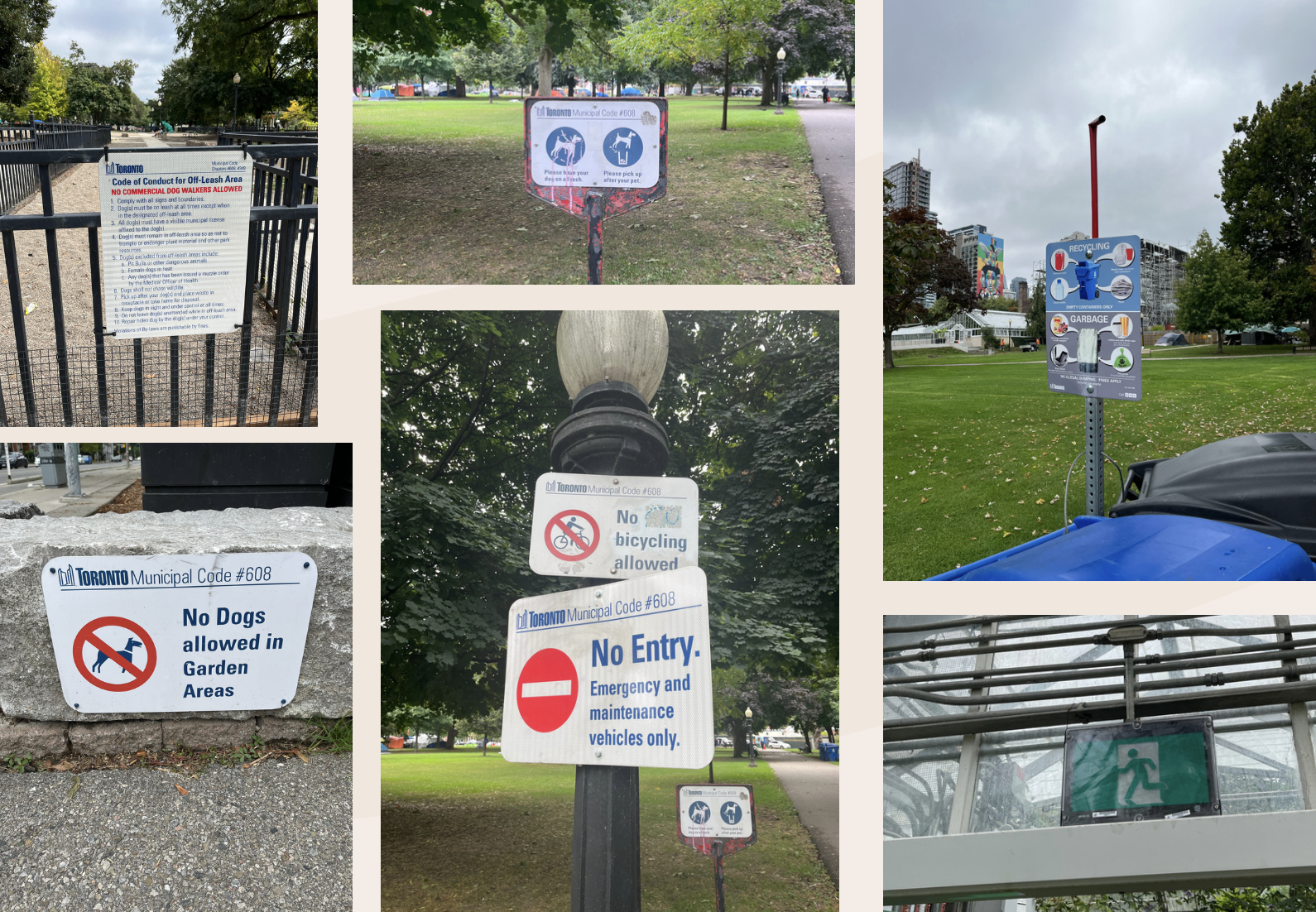
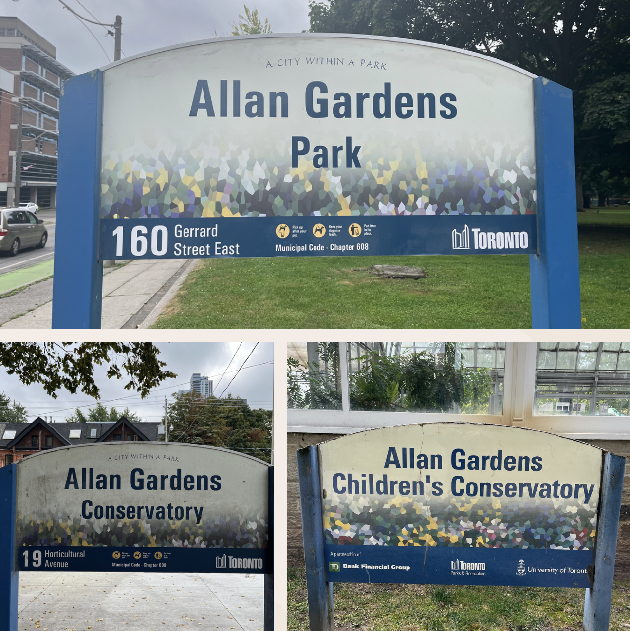
I conducted site visits to observe visitor behavior, photograph existing signage, and map the physical environment. These observations revealed critical gaps in the current wayfinding system and informed design priorities.
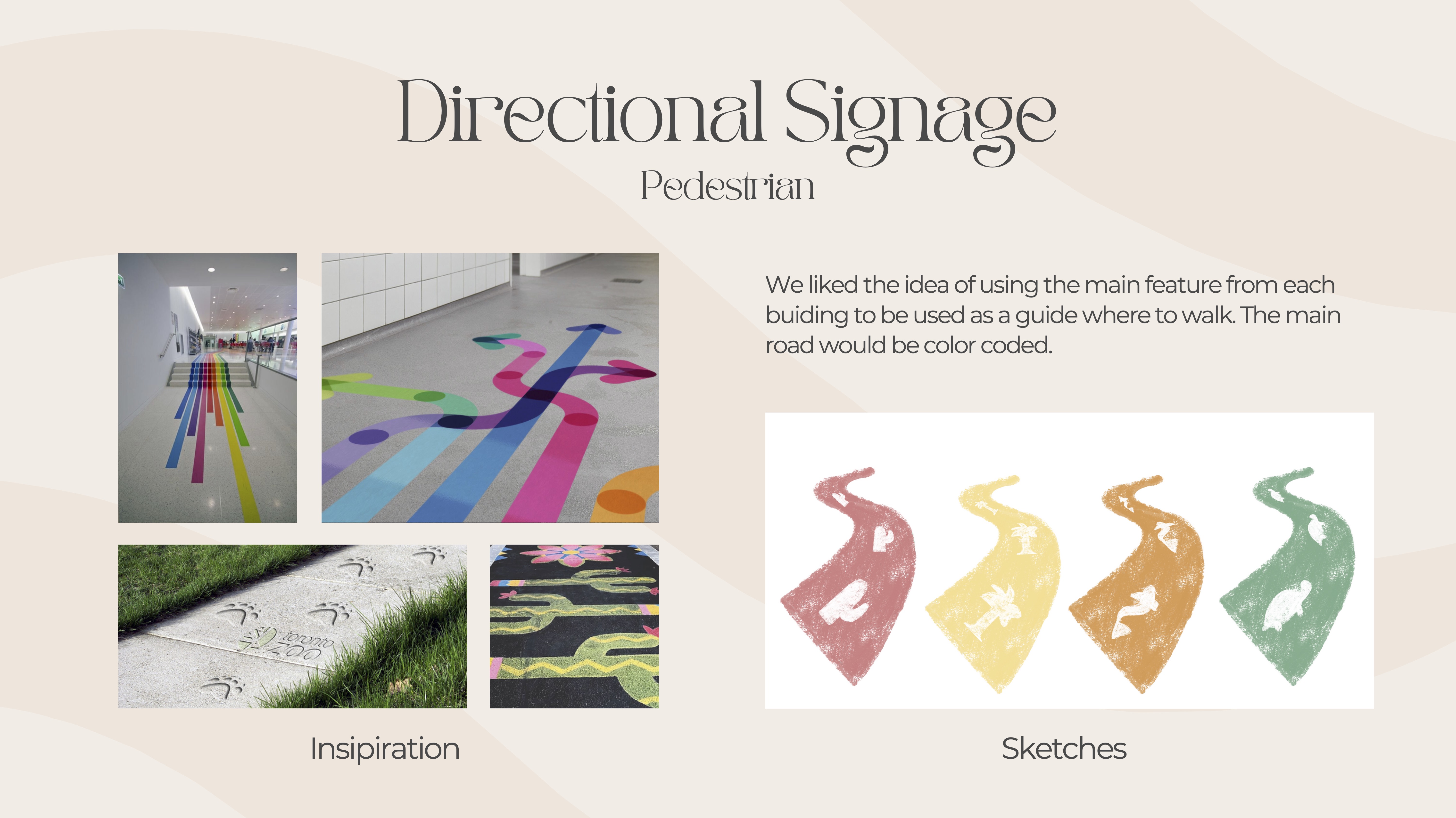
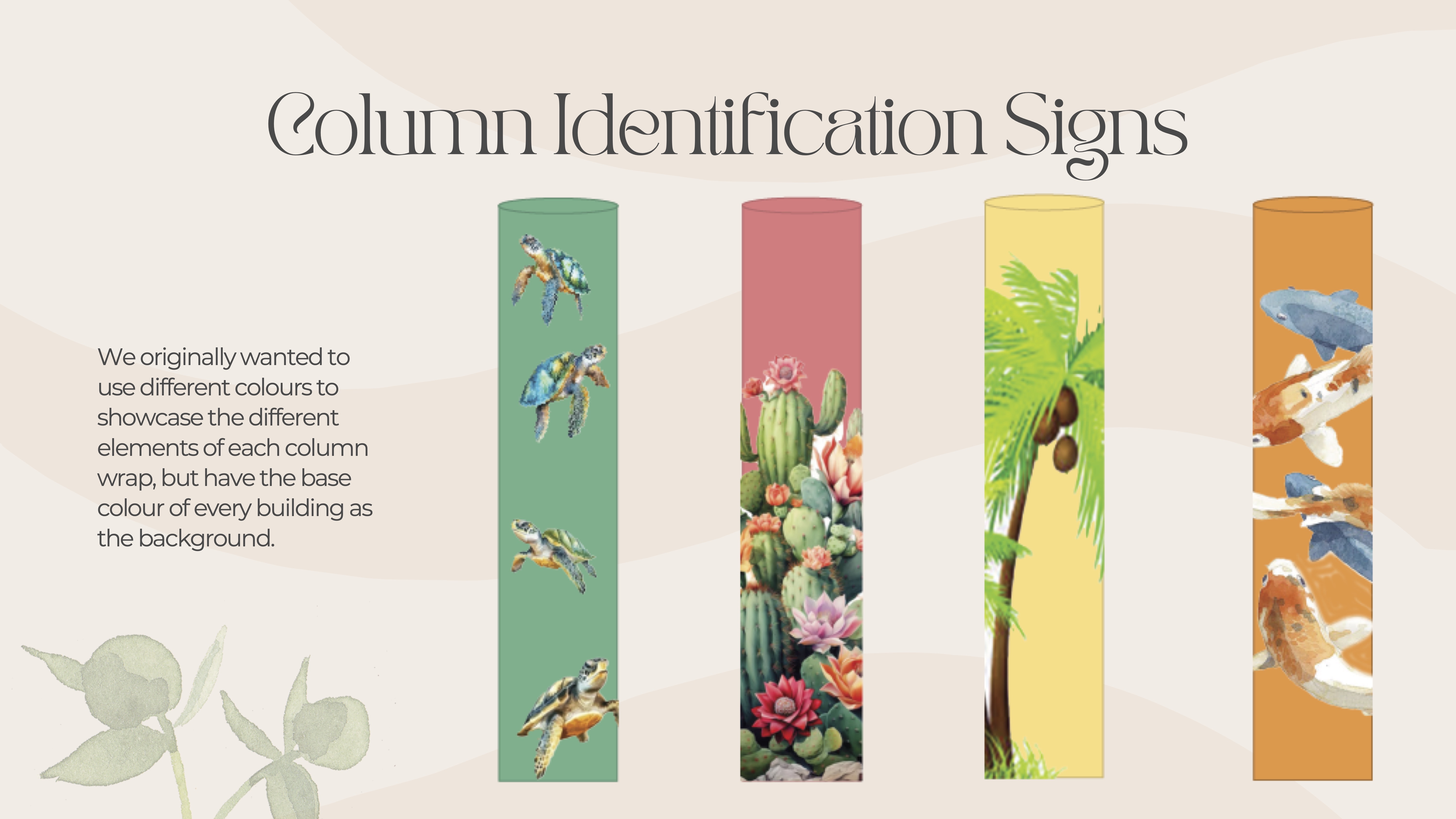
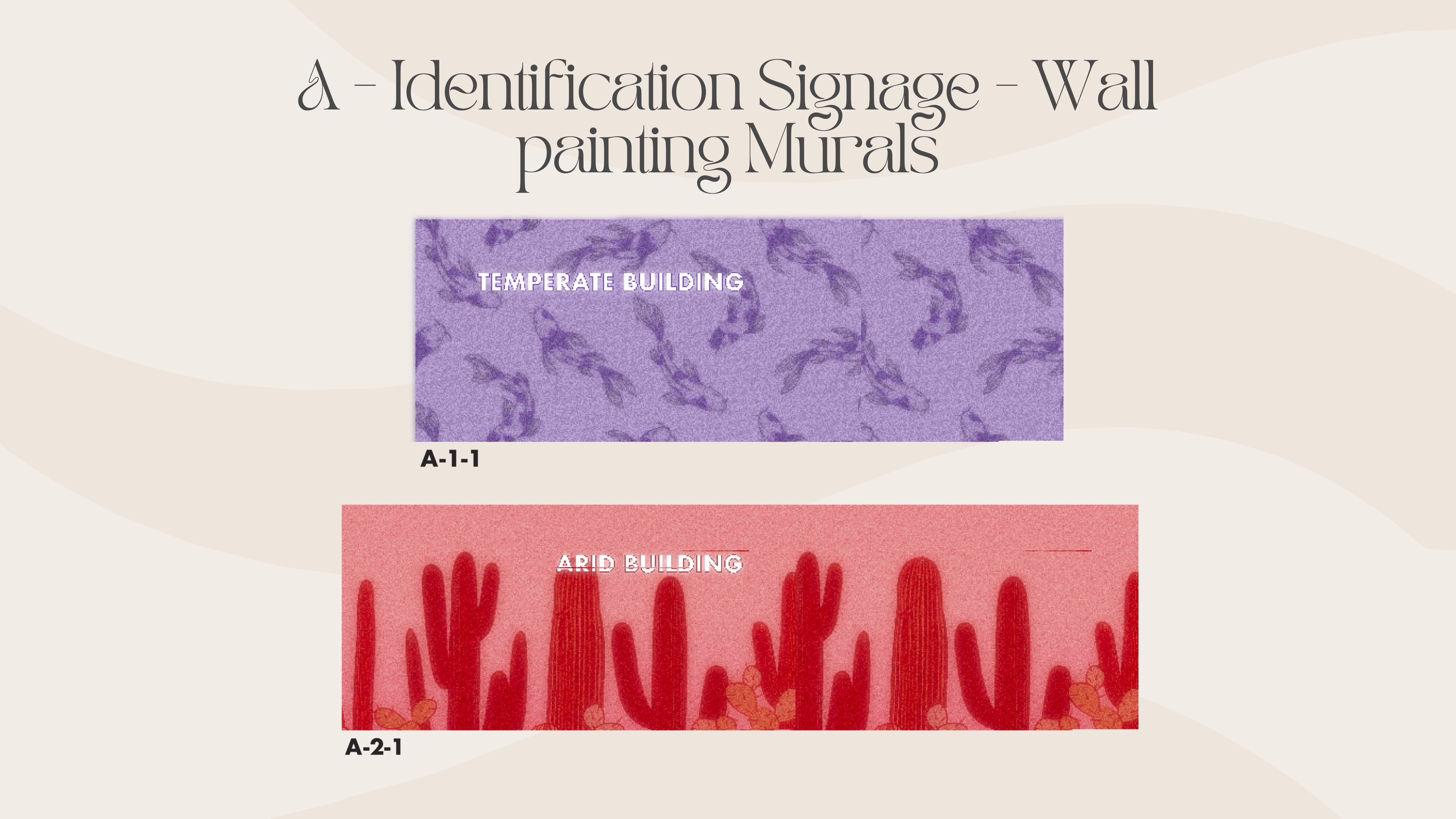
Identification signage: how the conservatory marks its presence at entrances and key landmarks across the site.
Orientational signage: maps and overview panels that help visitors understand the site layout and plan their route.
Directional signage: arrows and route markers guiding visitors from the parking lot toward the conservatory entrance.
Regulatory signage: rules, hours, and safety information that visitors encounter throughout the grounds.
Persona

Amelia Lancaster
Weekend visitor with mobility considerations
Amelia is a 62-year-old retired librarian who visits Allan Gardens once a month to enjoy the plant collections. She drives to the site but often struggles with unclear signage and long walking distances from the parking lot.
Goals
- Park conveniently and find the conservatory entrance easily
- Avoid unnecessary walking or wrong turns due to poor signage
- Feel confident navigating the site independently
- Enjoy a relaxed, stress-free visit
Frustrations
- No visible signs directing visitors from parking lot to conservatory
- Multiple entrances with no clear indication of which is correct
- Long walking distances when she takes the wrong path
- Inconsistent or missing wayfinding cues throughout the site
Key insights from observations
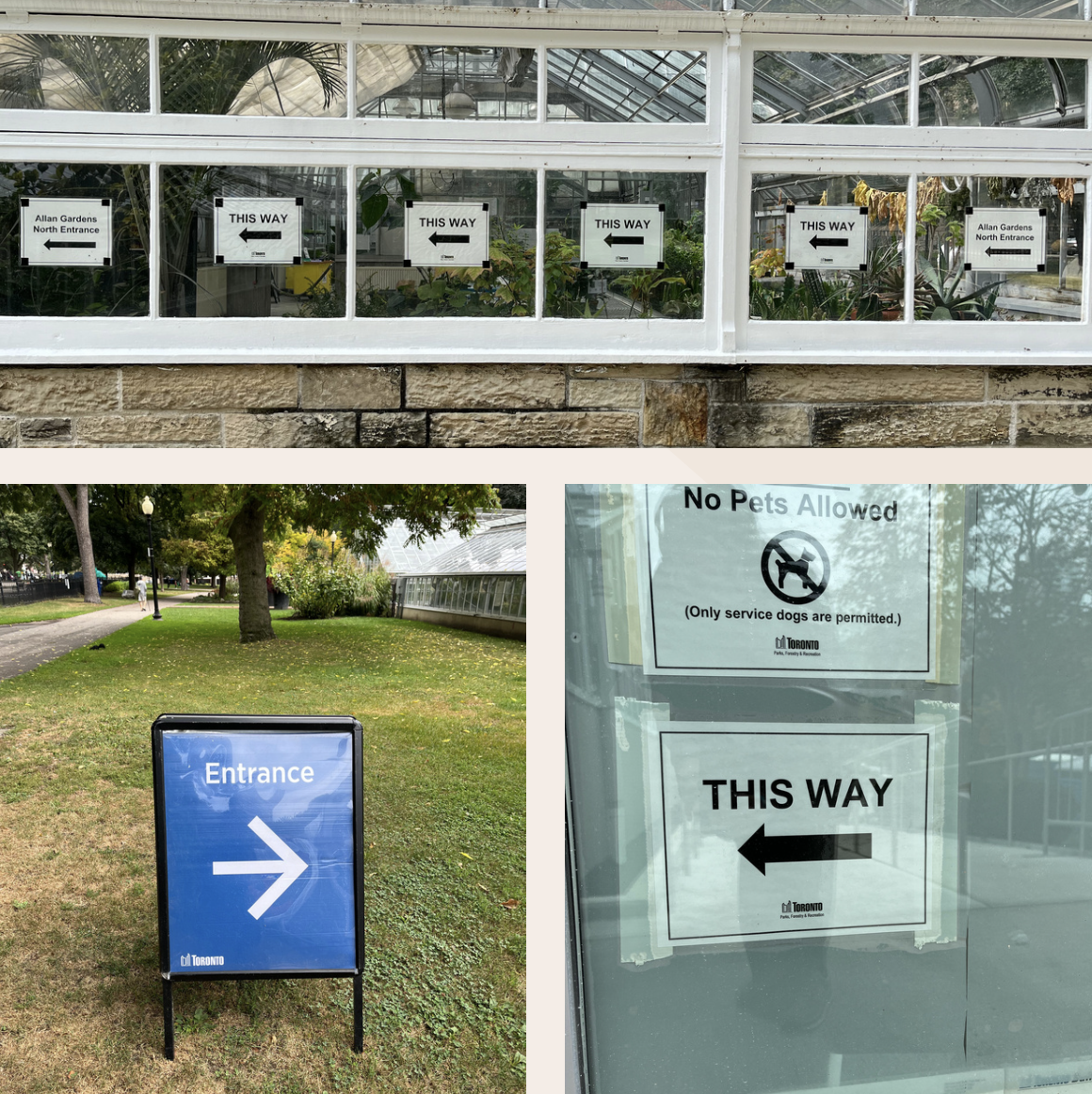
Visitors arriving by car cannot see the conservatory from the parking lot, leading to confusion about which direction to walk.
Existing signage is faded, inconsistent in style, and placed at decision points too late for visitors to course-correct easily.
Multiple entry points (including locked or secondary gates) create uncertainty about which entrance is the "right" one.
My Process
Discover
Conducted site visits and observations to understand visitor behavior and circulation patterns.
- Site photography and documentation
- Visitor observation sessions
- Existing signage audit
- Circulation and sightline mapping
Define
Synthesized findings to identify wayfinding pain points and design priorities.
- Journey mapping (parking to entrance)
- Decision point identification
- Accessibility considerations
- Heritage site constraints
Design
Developed a cohesive signage system with clear visual language and strategic placement.
- Sign typology and hierarchy
- Typography and iconography
- Material and color palette
- Placement strategy and mockups
Deliver
Finalized signage specifications and created implementation recommendations.
- Final signage designs
- Placement diagrams
- Material specifications
- Implementation guidelines
Concept development

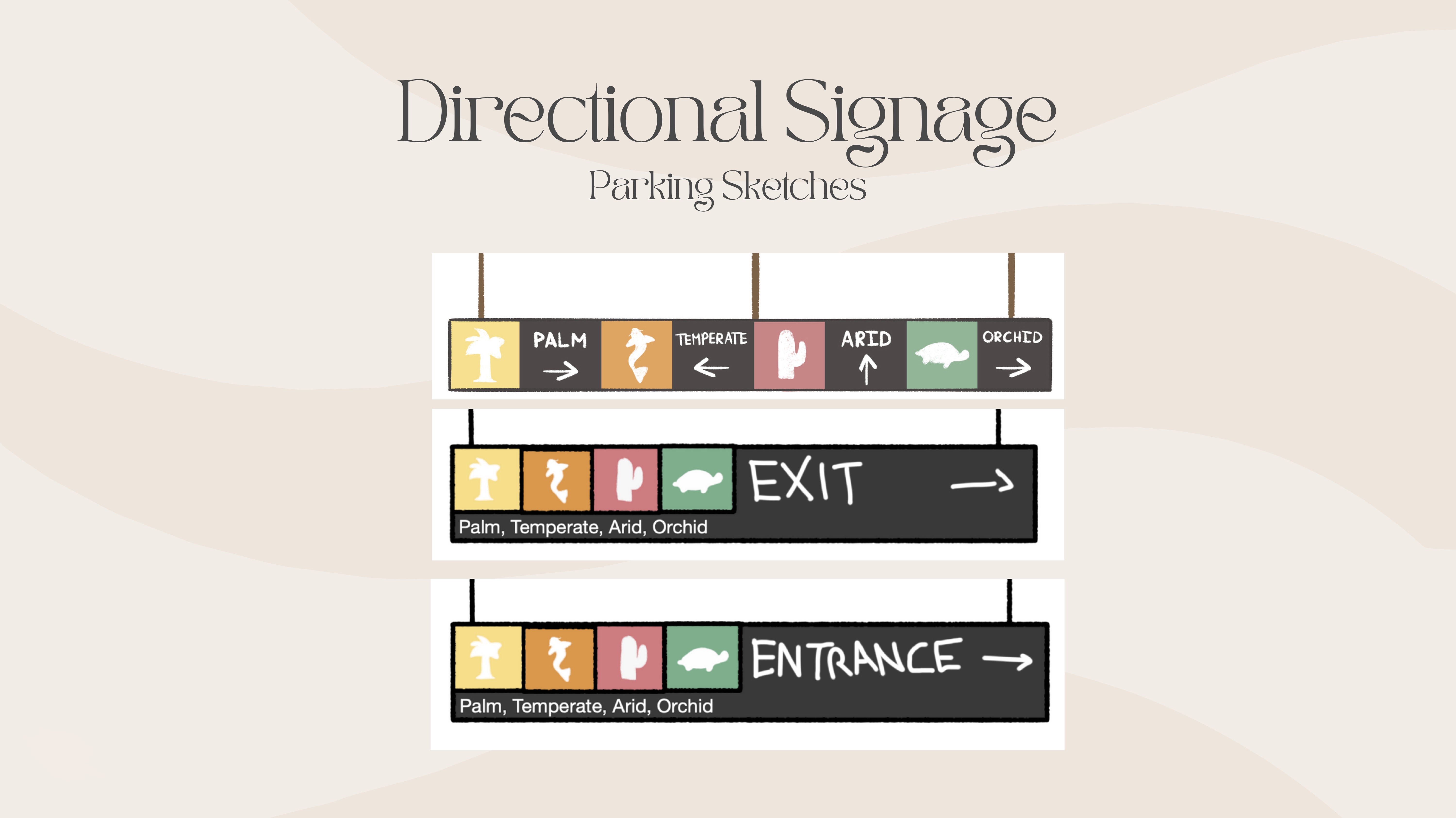
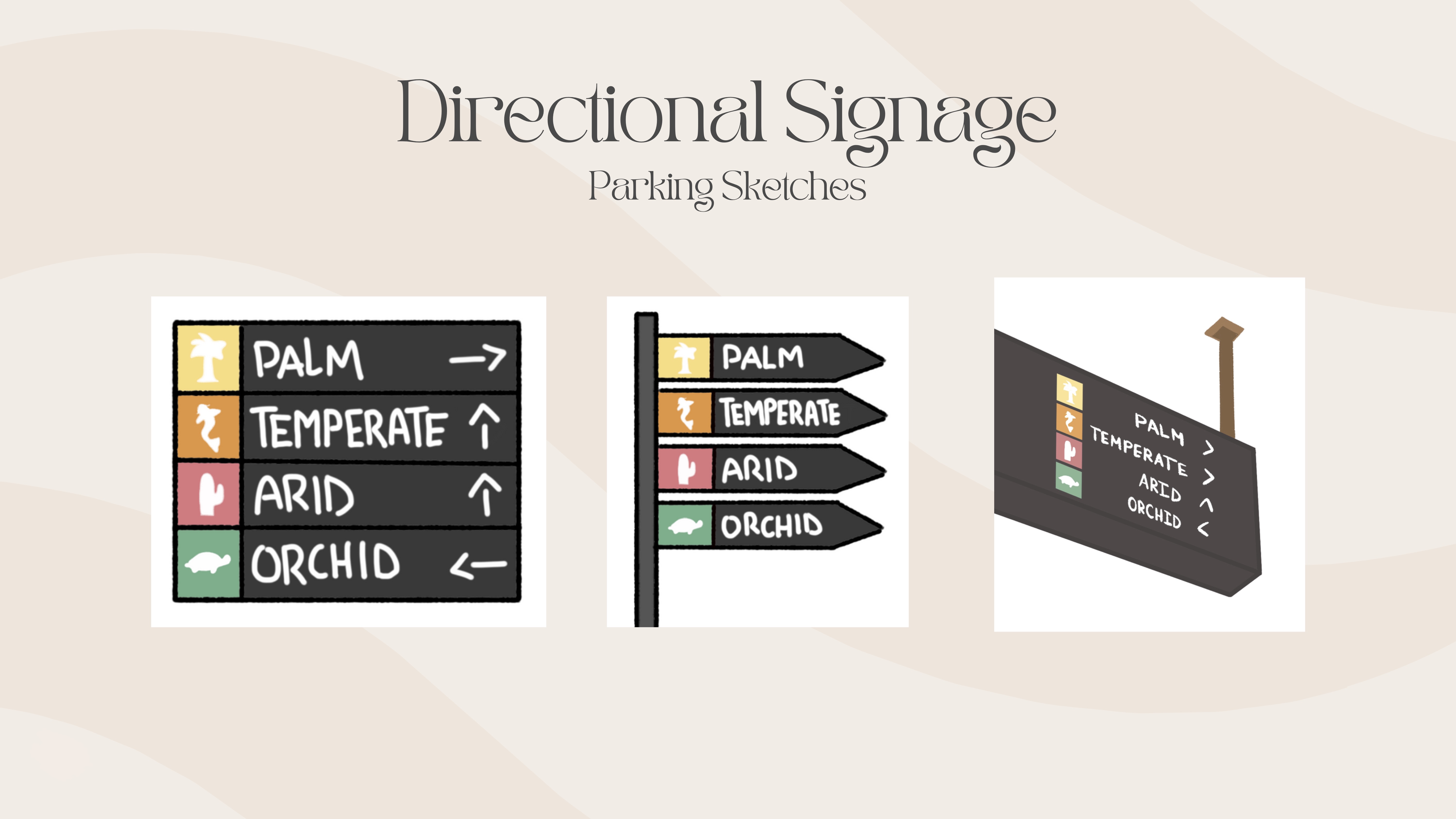
Early concepts explored different sign types, visual styles, and placement strategies. I tested various typographic hierarchies, iconography approaches, and color palettes to ensure signs would be visible, legible, and appropriate for a heritage site context. Iterations refined the balance between functional clarity and aesthetic integration with the conservatory's character.
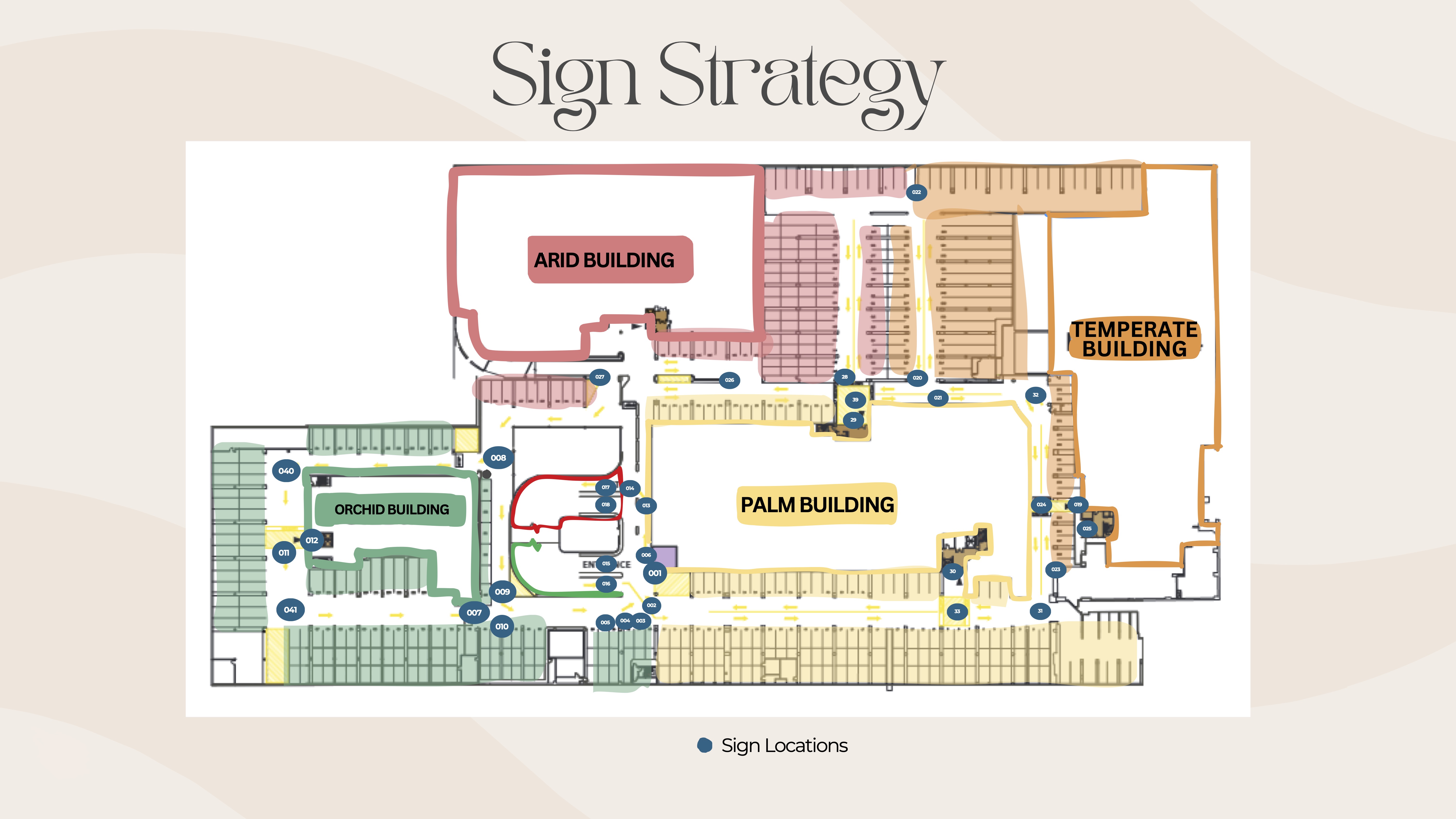
Journey mapping
I mapped the complete visitor journey from parking lot arrival to conservatory entrance, identifying every decision point, potential confusion moment, and opportunity for wayfinding intervention.
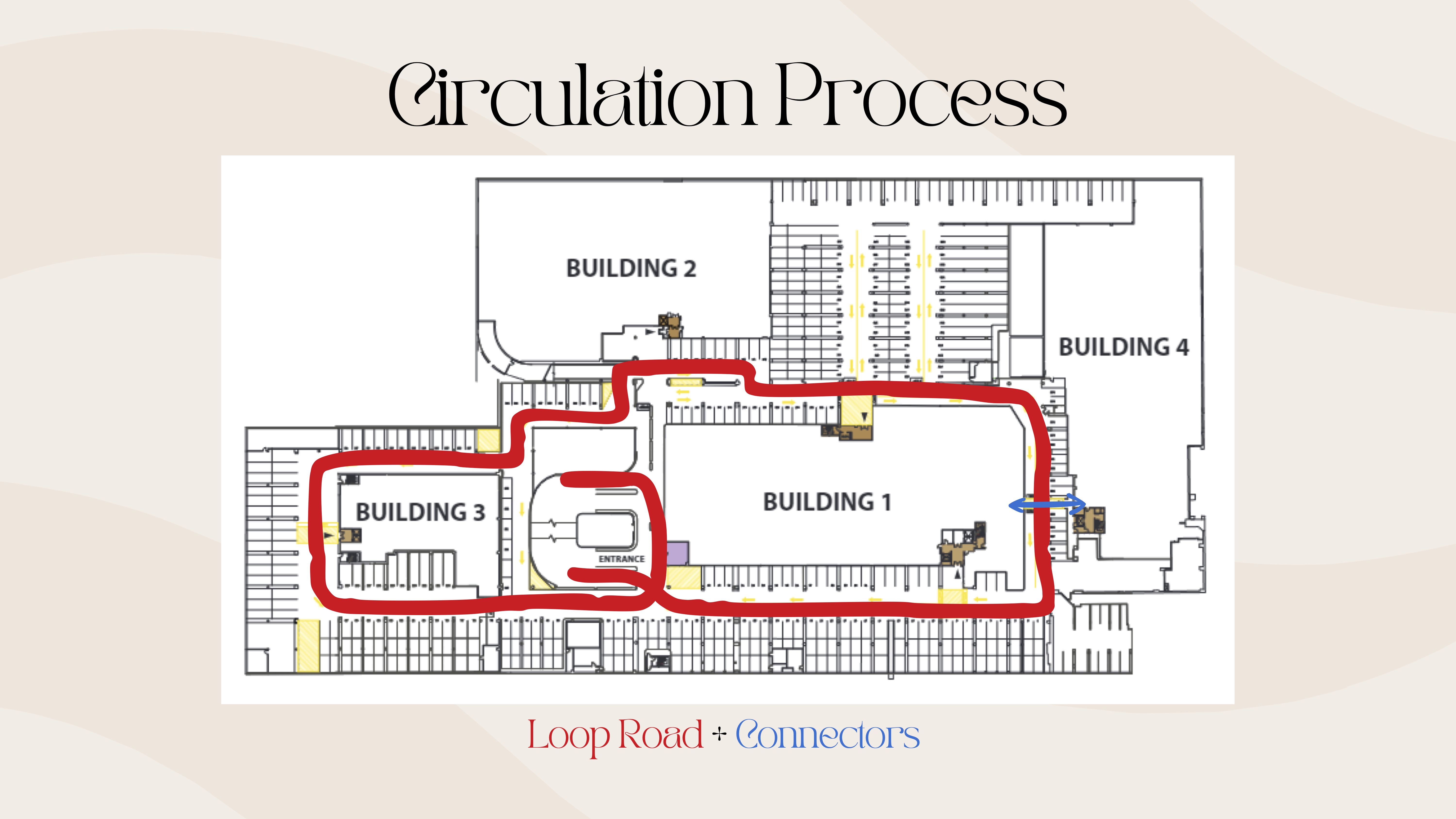
The circulation process maps the complete visitor journey from parking lot arrival to conservatory entrance, identifying every decision point, potential confusion moment, and opportunity for wayfinding intervention.
Outcomes
Key Improvements
The signage system introduces clear directional cues at every decision point, uses high-contrast typography for visibility, and integrates with the site's heritage character through material and color choices. Strategic placement ensures visitors see signs before reaching points of confusion, not after.
Key Learnings
Wayfinding isn't just about signs—it's about understanding visitor behavior, anticipating decision points, and designing for confidence. Site observations revealed that people need reassurance along the entire journey, not just at the start. Effective wayfinding reduces cognitive load and transforms a confusing experience into a welcoming one.
Impact & Reflection
This project deepened my understanding of how physical space, user behavior, and information design intersect in wayfinding systems. I learned that effective wayfinding is less about adding signs and more about understanding visitor journeys, anticipating confusion points, and designing for confidence at every step. The most successful interventions were those that felt intuitive and unobtrusive, guiding visitors without overwhelming them.
- Improved visitor navigation from parking lot to conservatory entrance
- Reduced confusion and wrong turns at key decision points
- Enhanced accessibility and confidence for visitors with mobility considerations
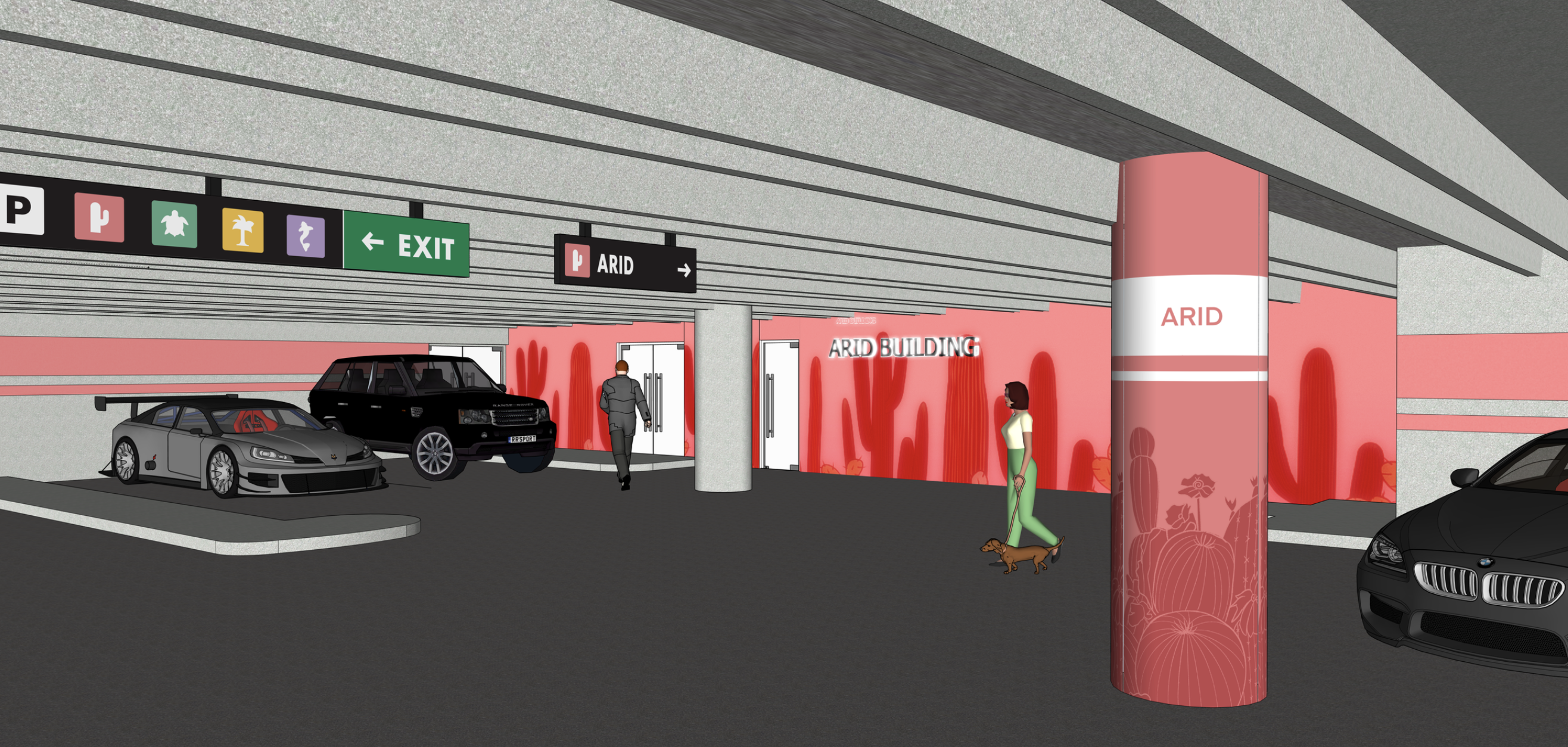
Final Design
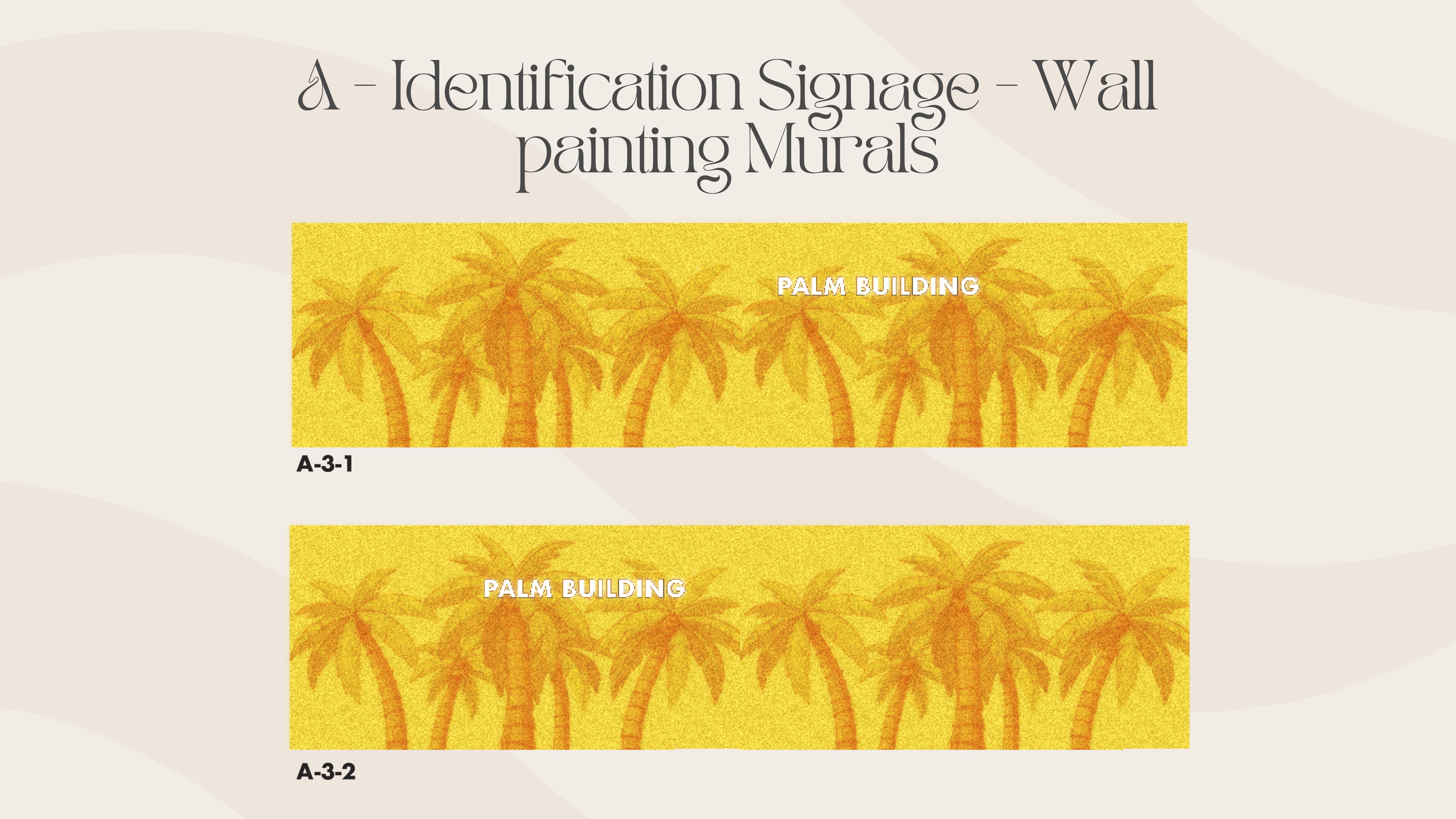
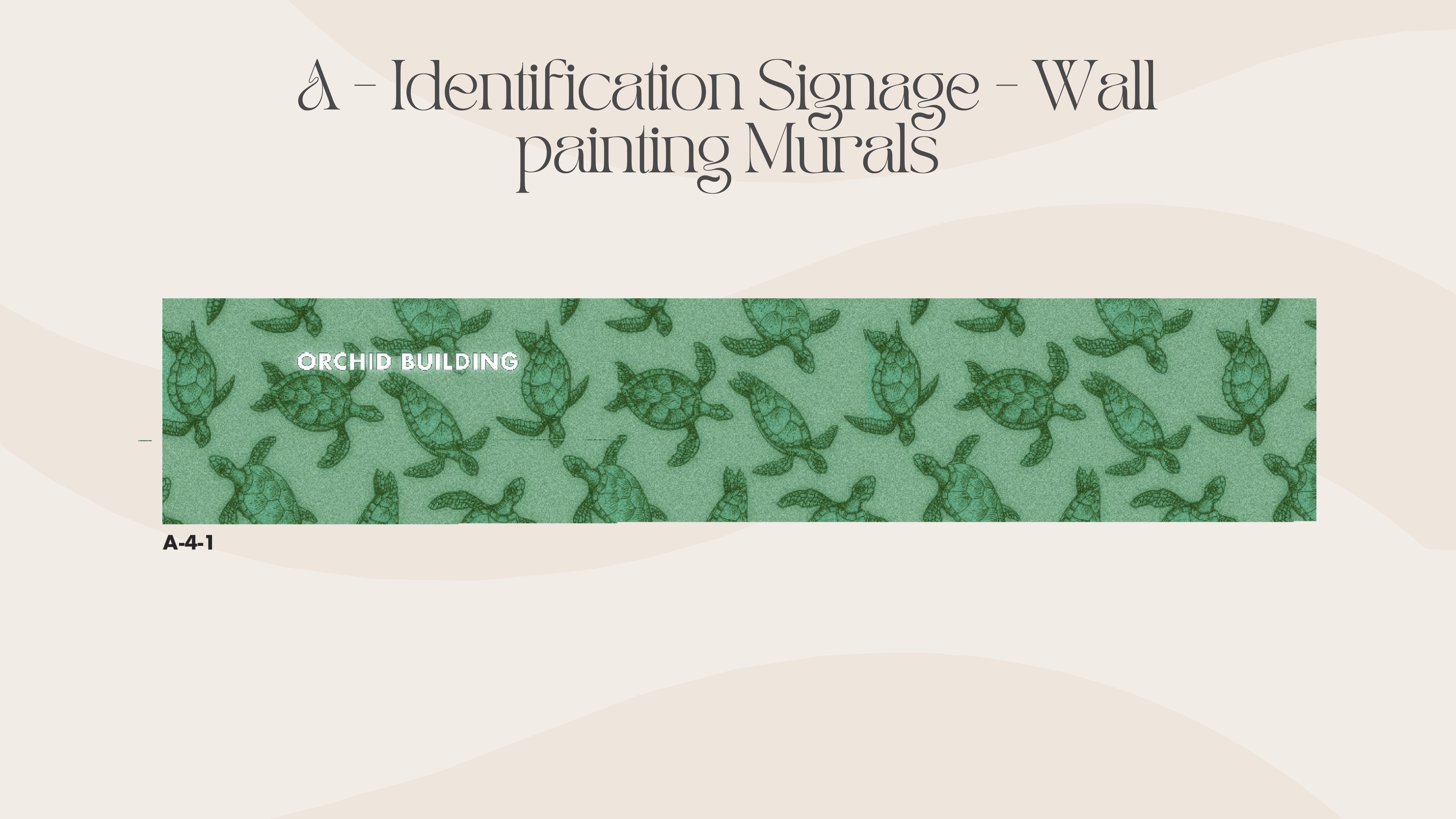
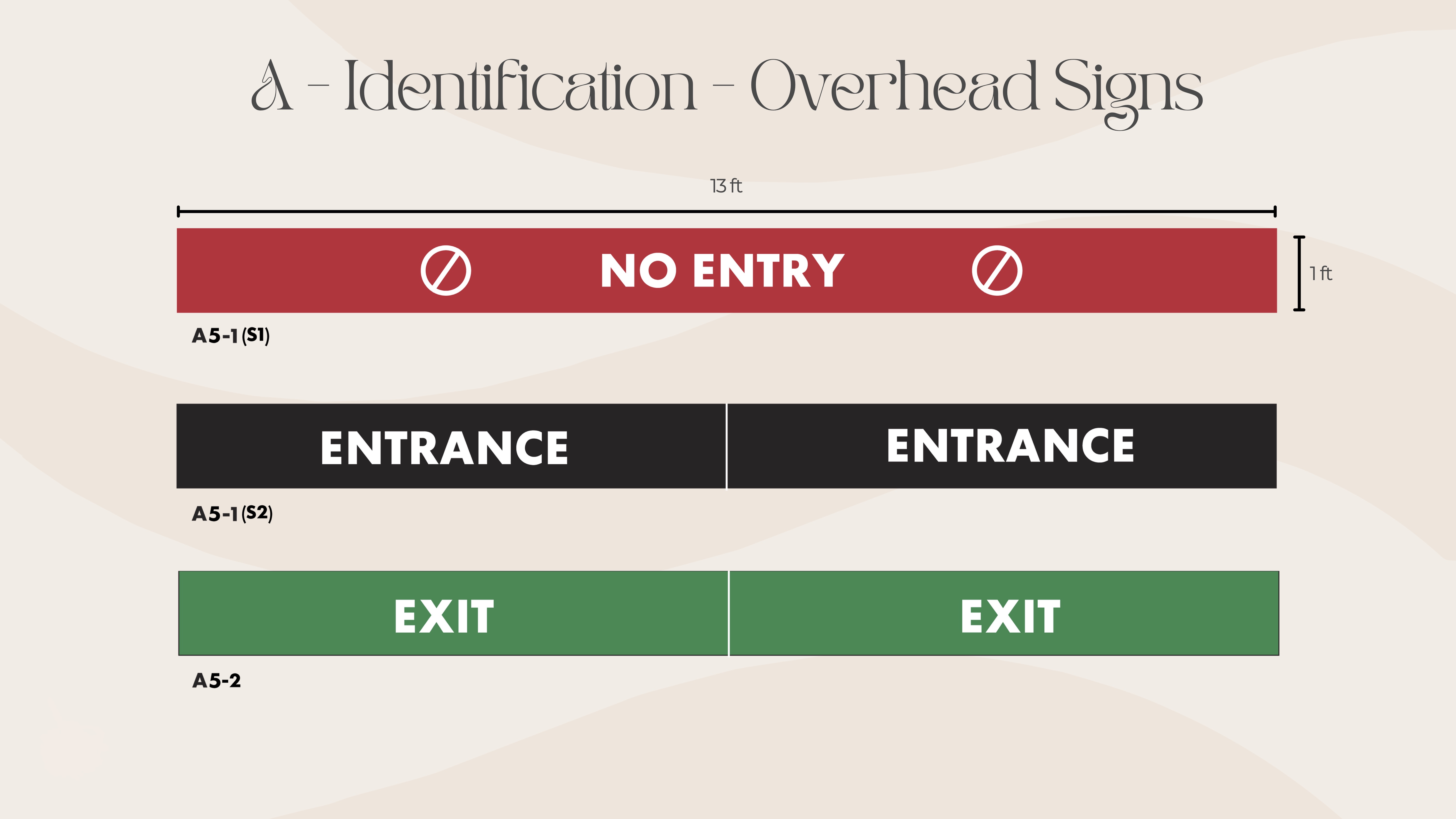
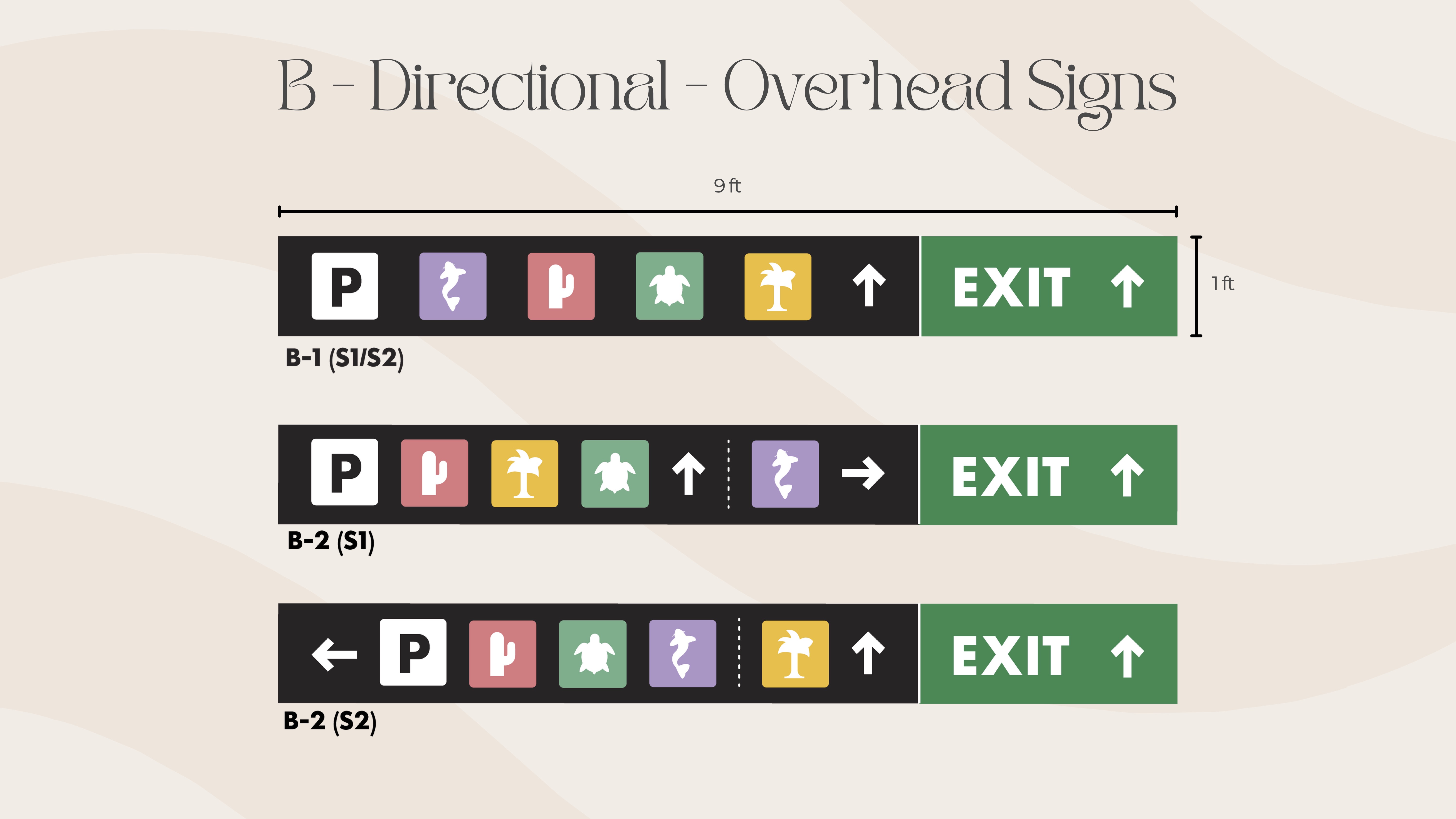
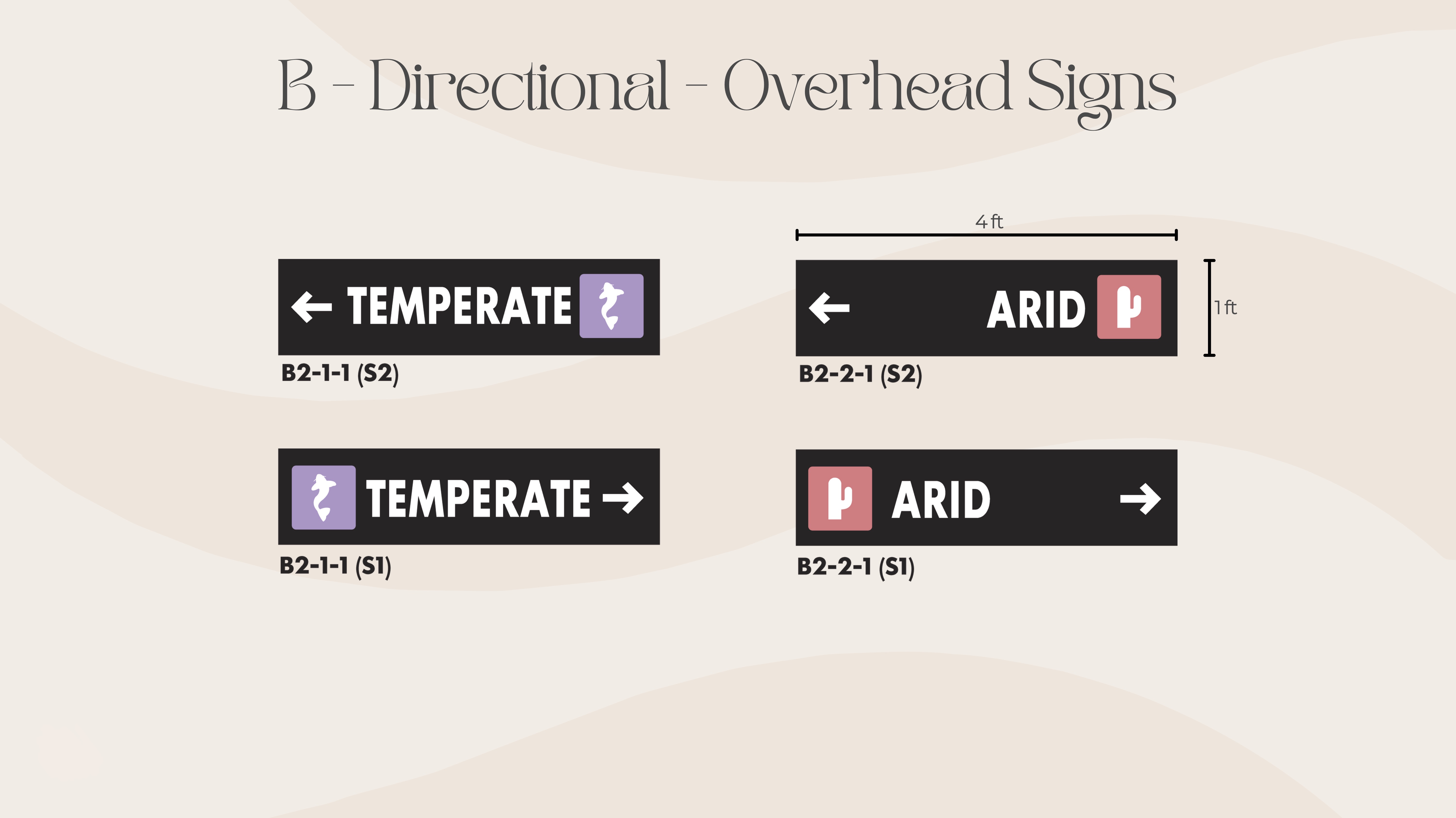
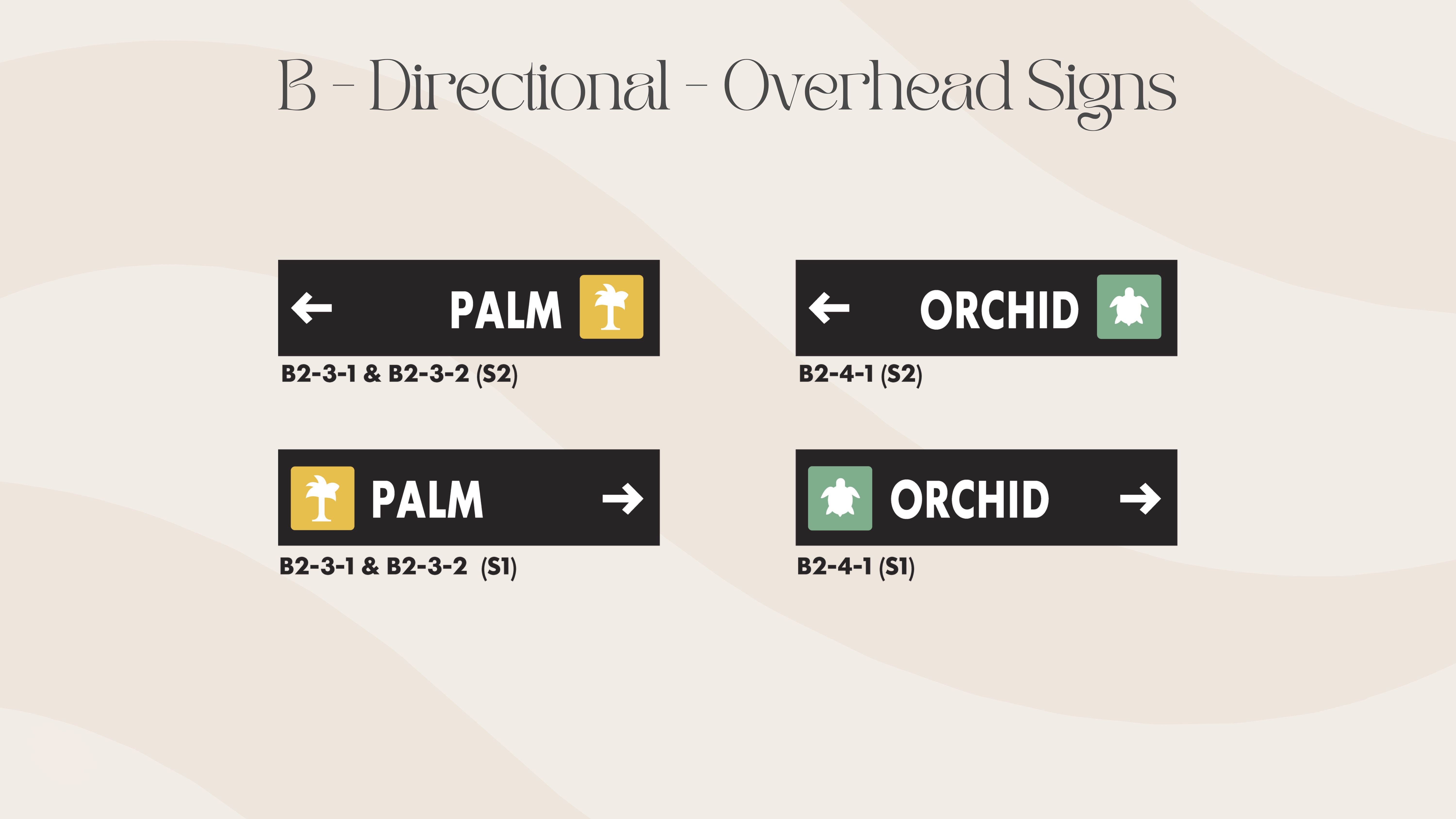
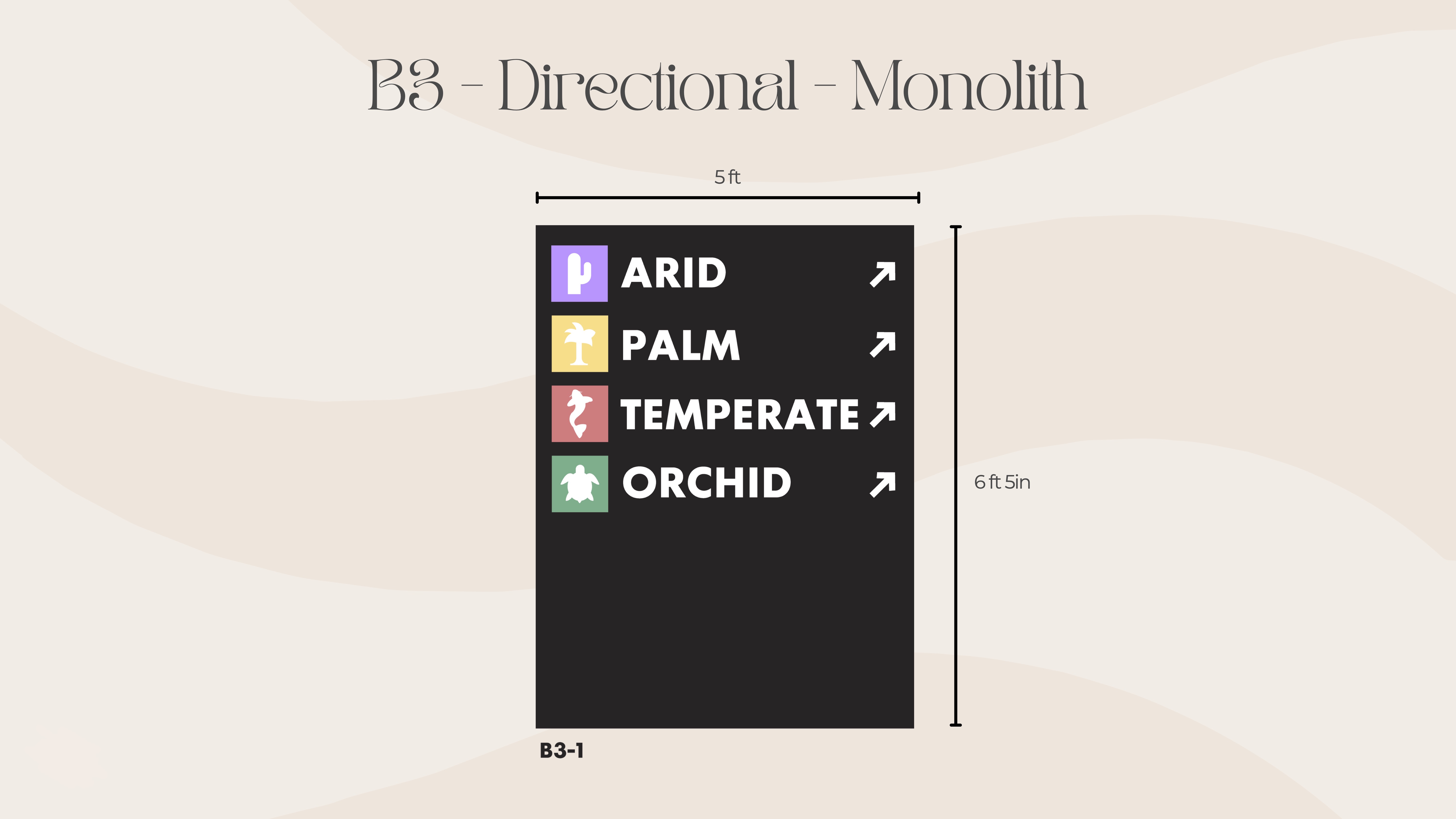
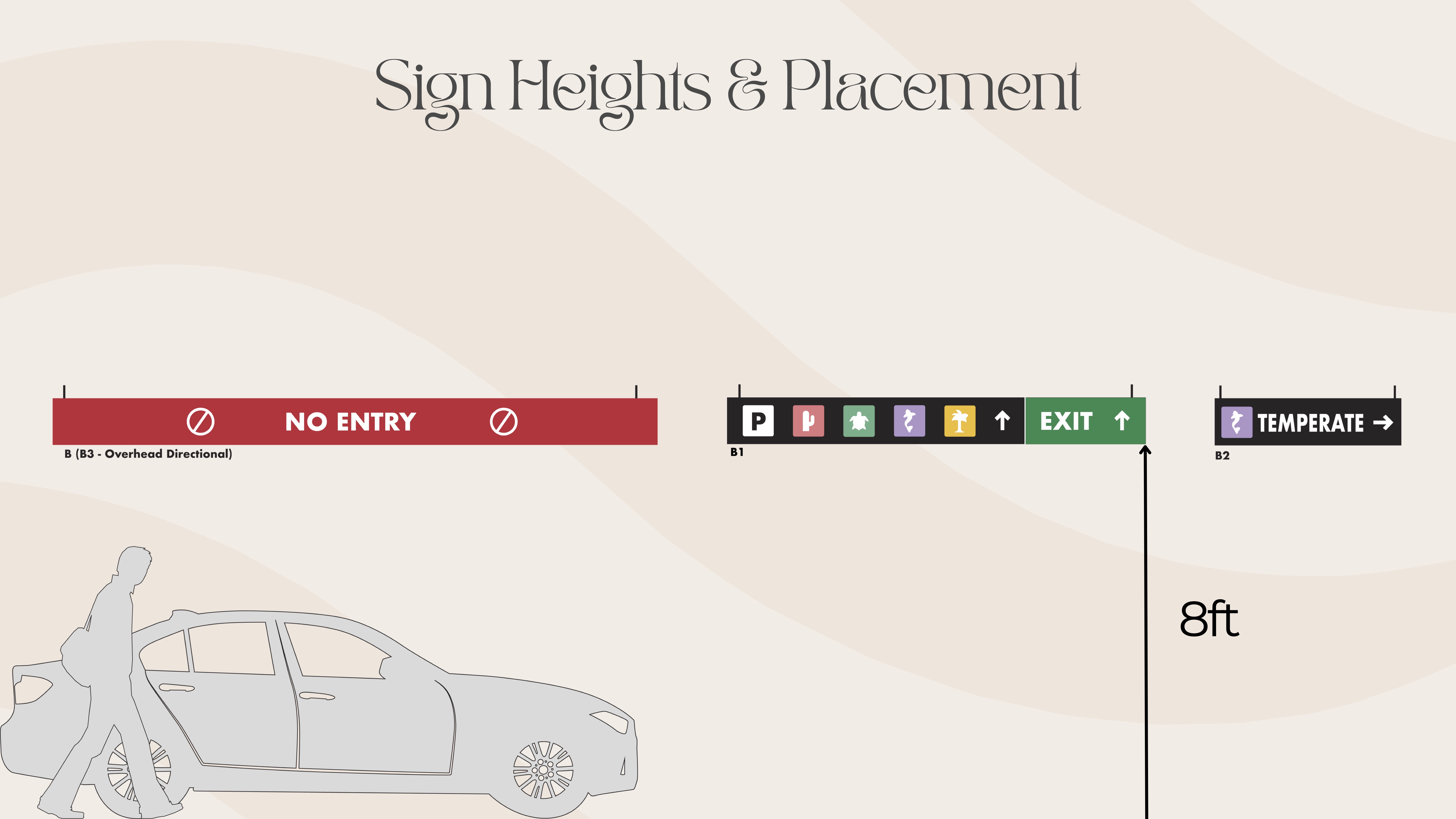
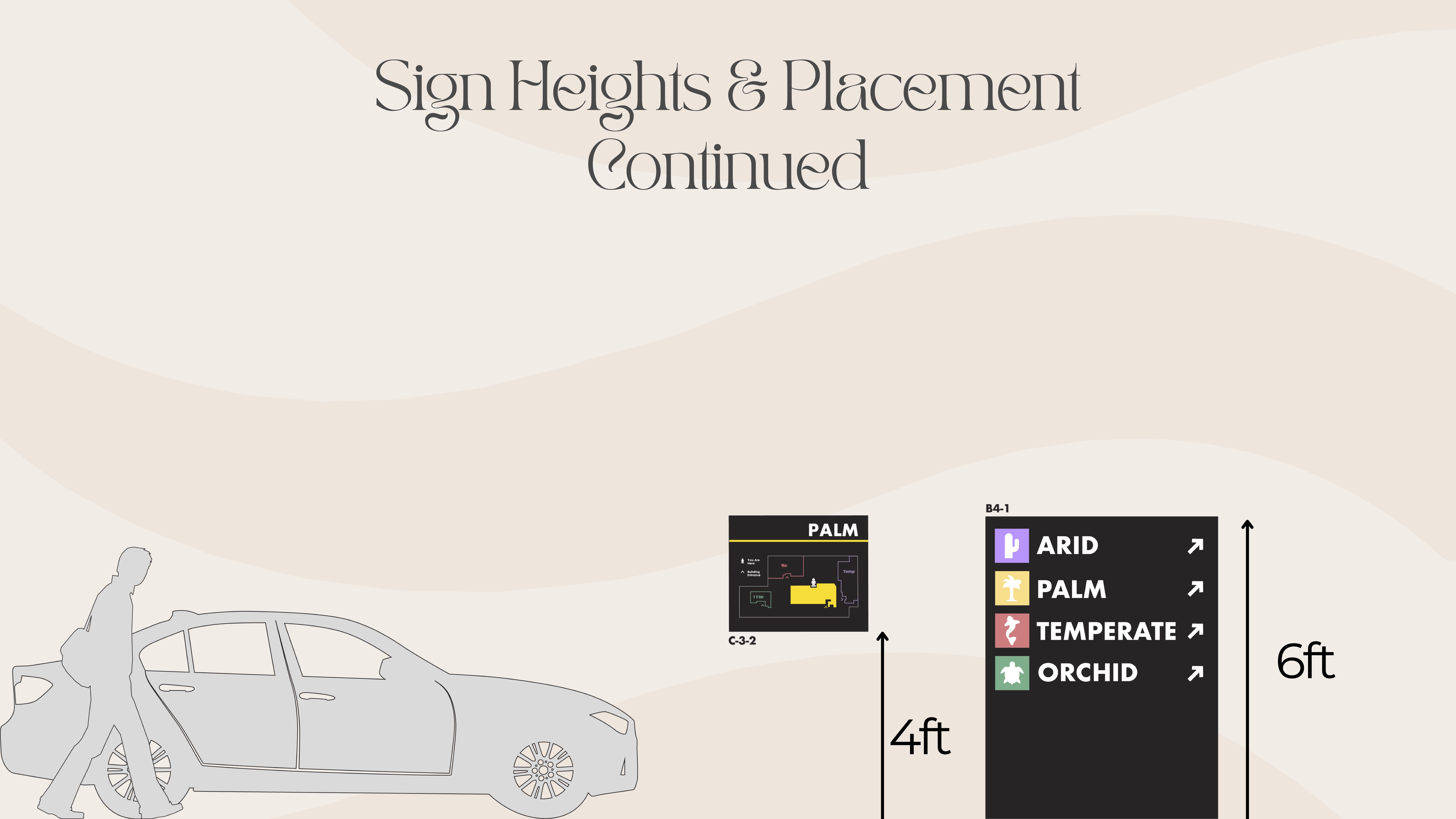
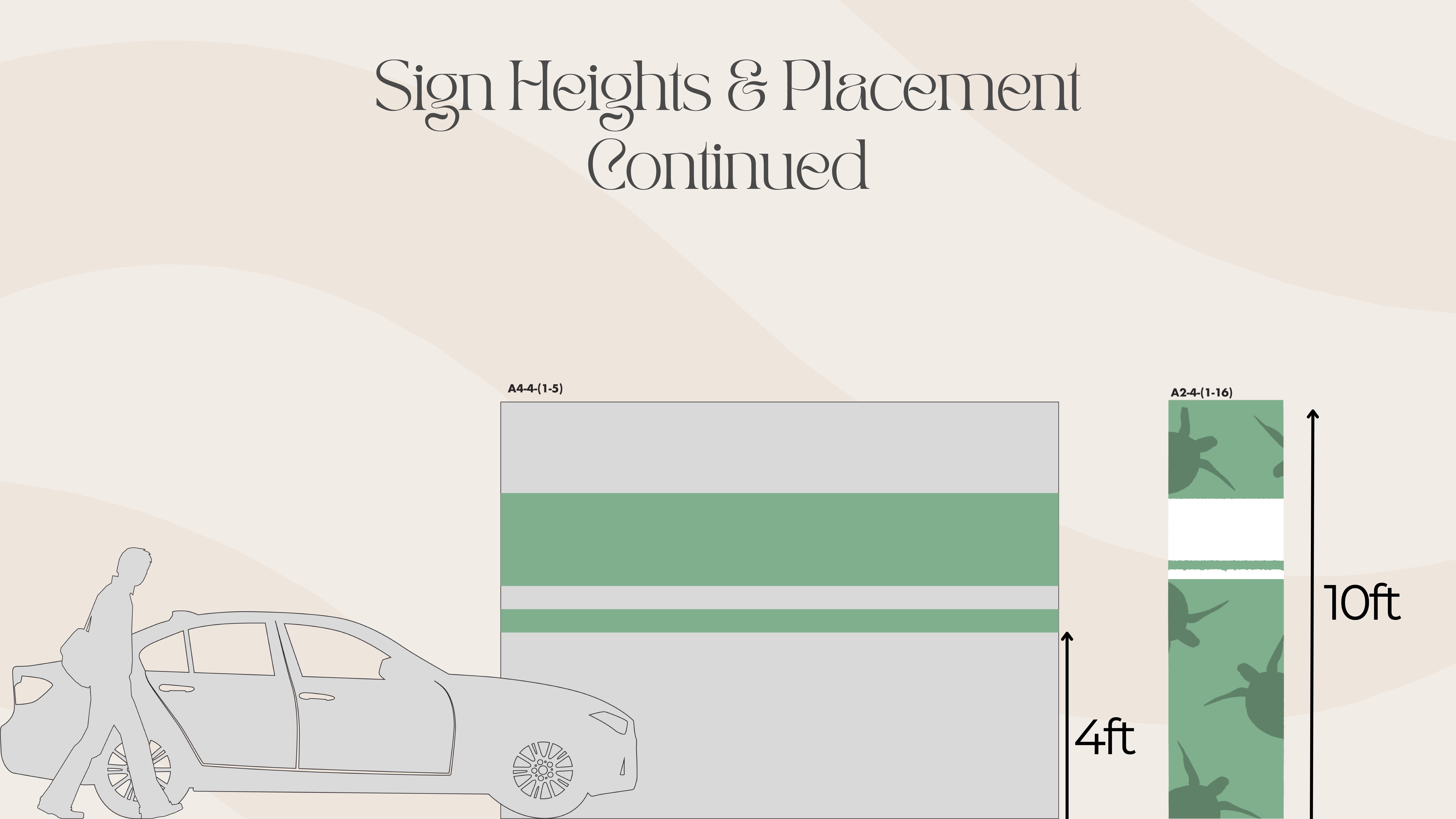
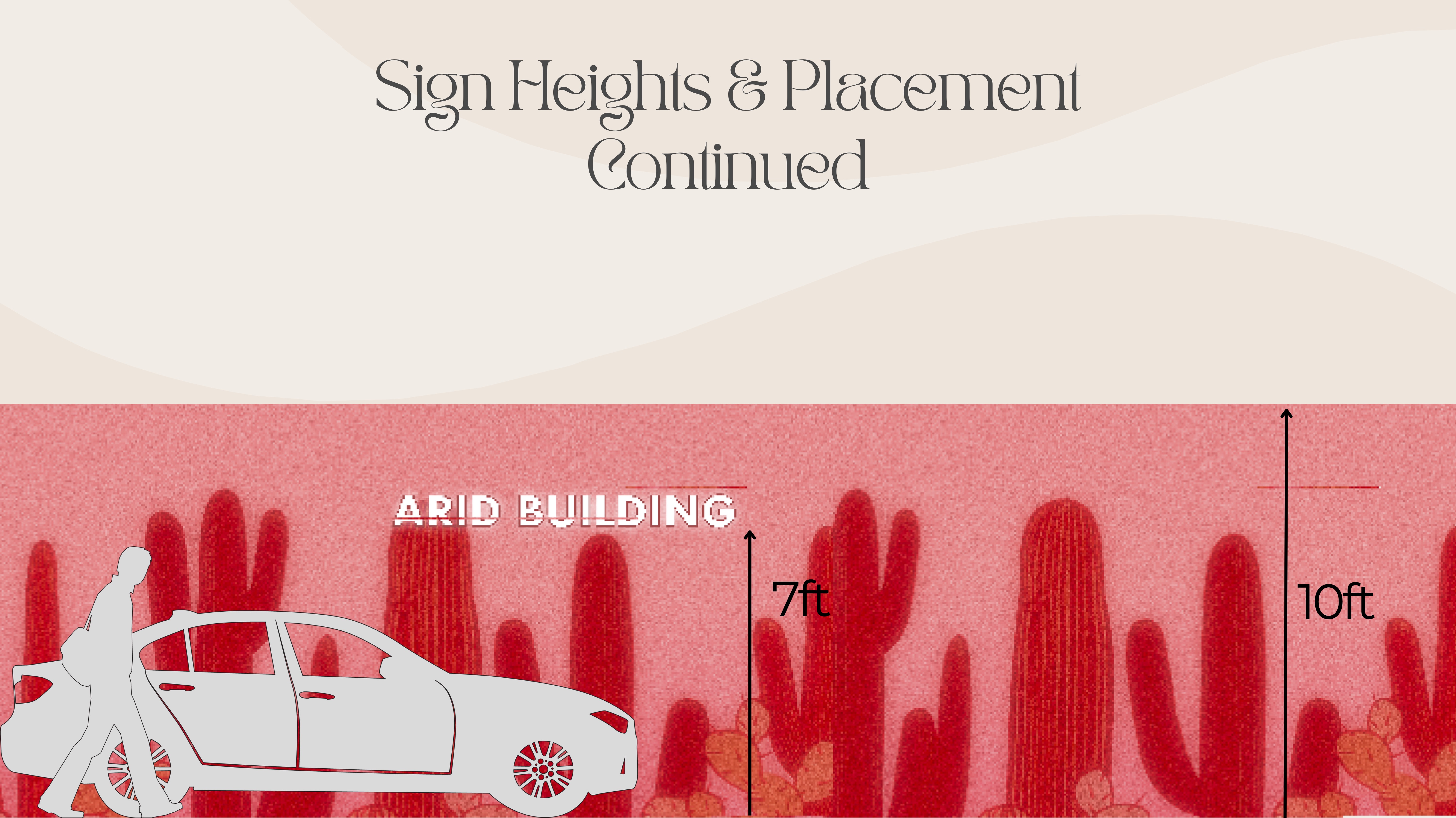
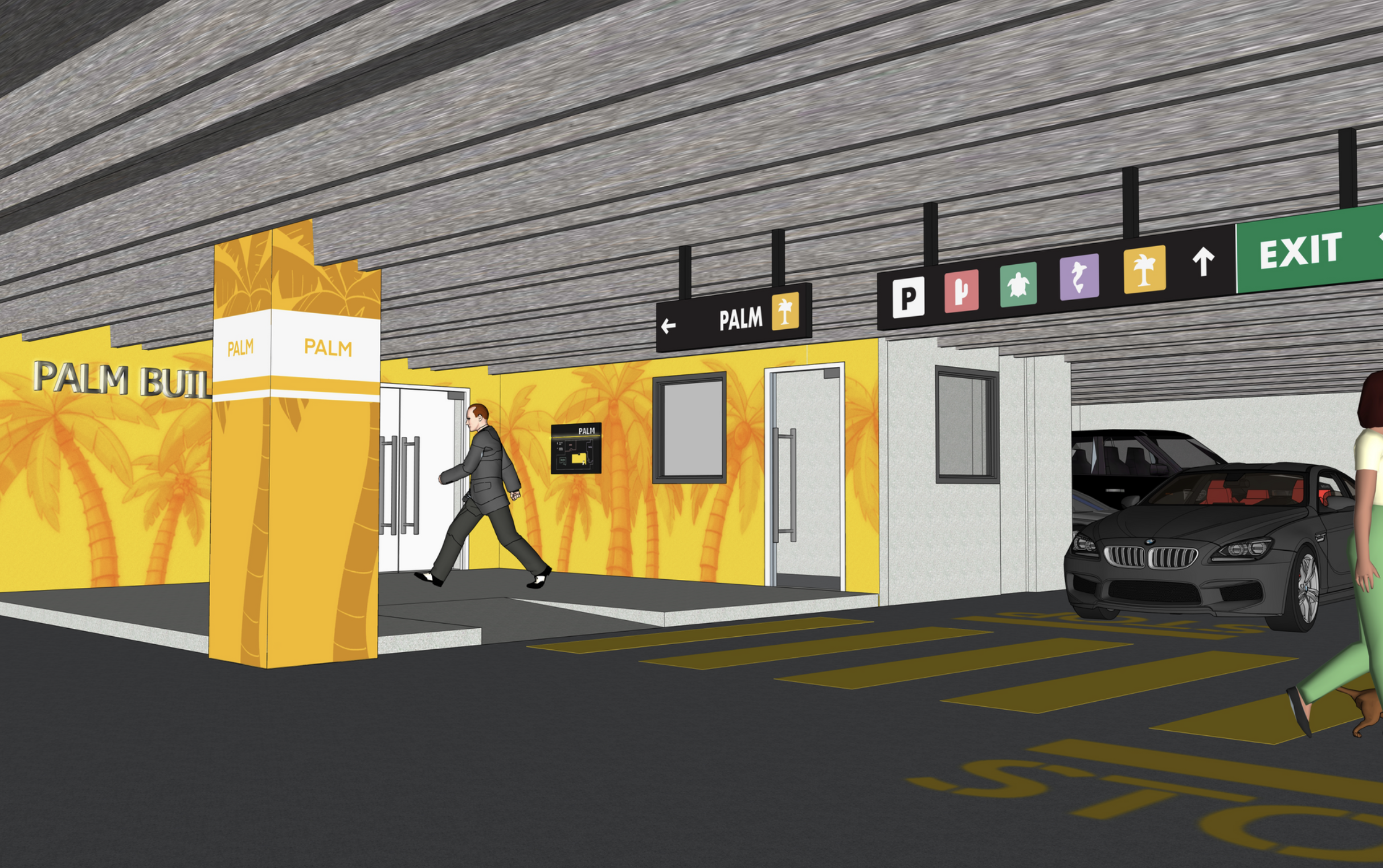
The final signage system includes directional signs at decision points, informational panels at key locations, and identificational signs at entrances. Each sign uses clear typography, intuitive iconography, and a color palette that complements the conservatory's heritage character while ensuring high visibility and legibility for all visitors.