
The Giveback – Partners In Health Donation Kiosk
Project Details
Partners In Health (PIH) is a global health nonprofit that delivers long-term healthcare in communities facing poverty and crisis. As part of a Real World Design Project studio, our team was challenged to imagine how PIH could meet potential donors in the middle of their everyday routines.
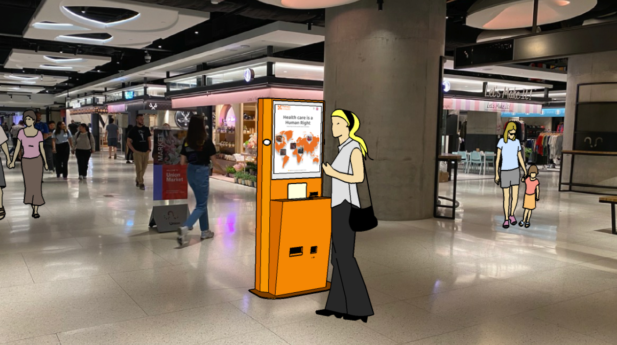
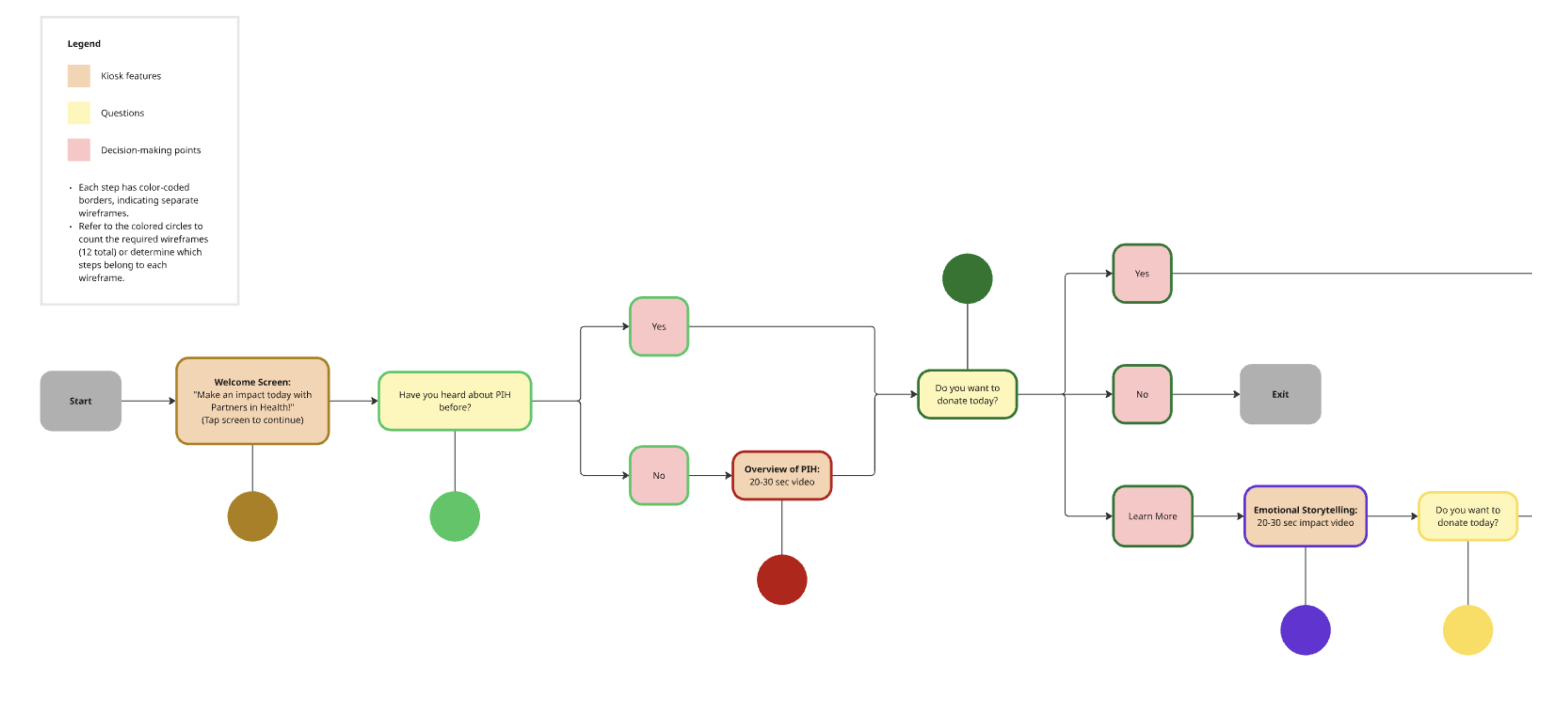
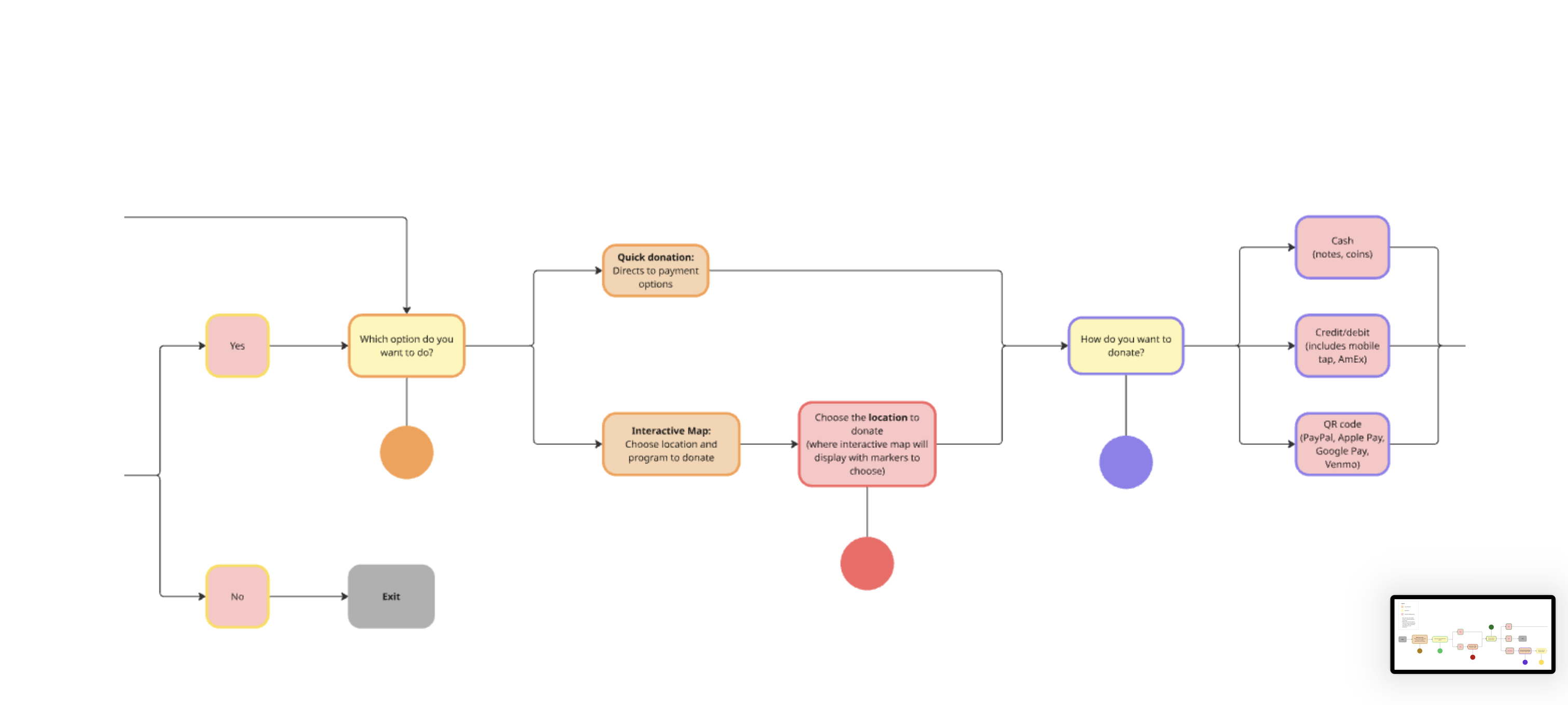
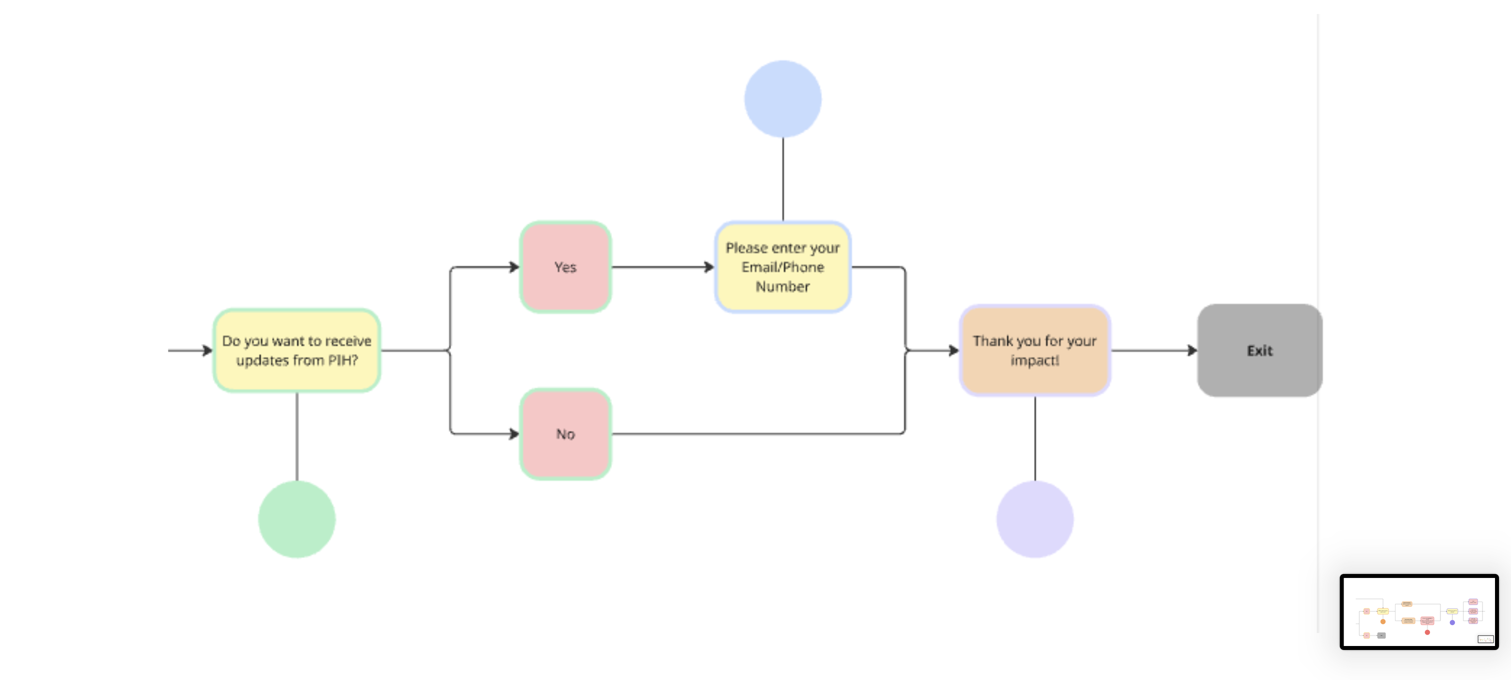
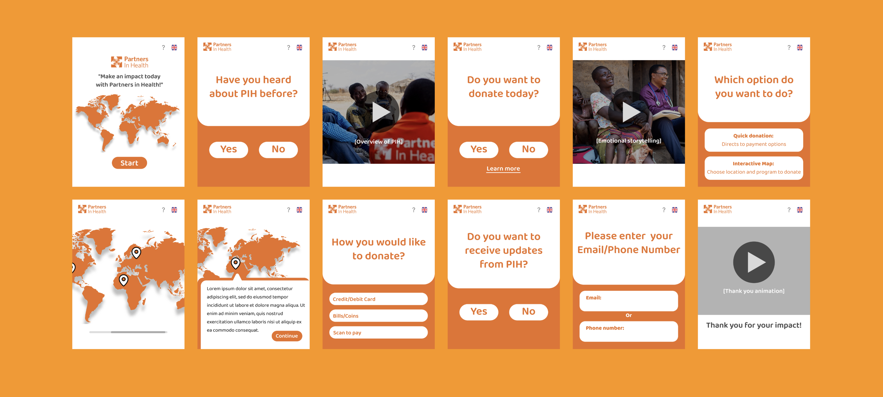
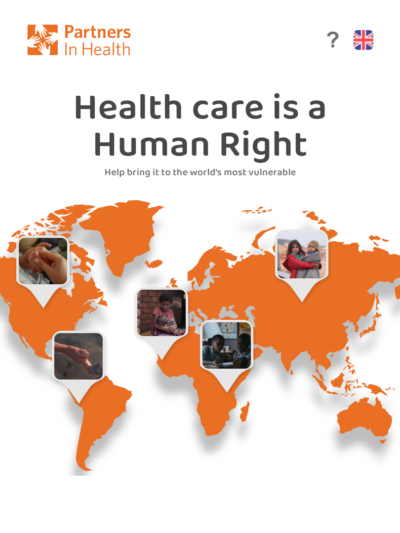
The Giveback is a concept for a touch-screen donation kiosk placed in Toronto's Union Station. The experience uses simple language, clear impact stories, and a fast, three-step flow to help commuters understand who PIH is, why their donation matters, and how to give in under a minute.
Problem
Commuters move quickly through transit spaces and are constantly bombarded by advertising. PIH has little brand recognition in this context, and existing donation flows feel long, text-heavy, and disconnected from the real people PIH supports. The challenge was to communicate trust and impact fast, without feeling intrusive, confusing, or guilt-driven.
Solution
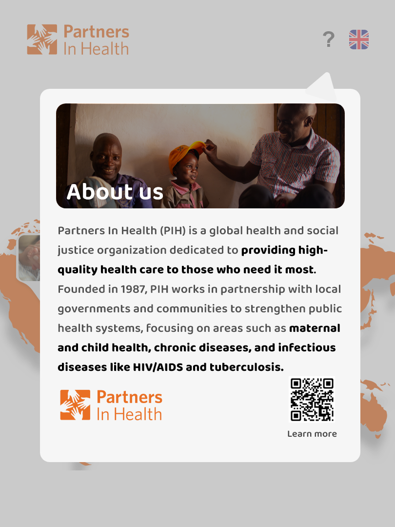
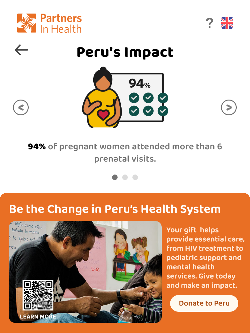
The Giveback is a kiosk experience that invites commuters to "give back in under a minute." The interface combines a simple three-step flow, large tap-targets, and impact-based giving options (for example, "Fund a day of maternal care") so donors can choose an amount that feels meaningful. A short story panel and a clear confirmation screen reinforce where the money goes and how PIH will stay in touch.
Constraints
- 8-week academic project with no access to real payment hardware
- Limited face-time with PIH stakeholders, mostly asynchronous feedback
- Research restricted to a small number of intercept interviews and an online survey
- Needs to work for a wide age range and both first-time and repeat donors
Scope & Limitations
- In scope: Discovery research into donor motivations and barriers, kiosk user flows, information architecture, and high-fidelity screens, prototype in Figma for usability testing
- Out of scope: Engineering implementation and payment processing integration, final brand guidelines and visual system for PIH, long-term analytics or CRM integration
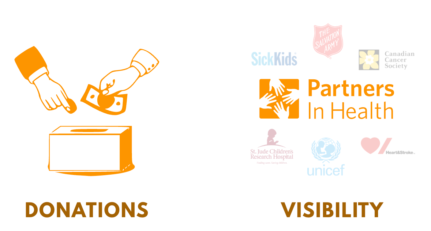
Competitive Analysis & The Gap
We audited donation experiences in transit stations, grocery checkout campaigns, and peer global-health organizations. Many relied on small print and long mission statements, or on impulse "round up" prompts with little explanation. Few experiences clearly showed what each dollar amount funds, especially in a fast-moving environment like Union Station.
Transit charity posters with generic "Donate now" messaging but little explanation or feedback.

Global-health donation pages that explain impact in detail but are hard to use on the go.
Persona

Maya Patel
University student & social-media donor
Maya is a university student in Vancouver balancing studies with a part-time job. She values transparency and wants to see exactly how her money helps. She is not a recurring donor, but she is highly influential online, often sharing causes with her network. She responds best to authentic, story-driven campaigns that feel personal and mobile-first.
Goals
- Support causes that align with her values (mental health, education, climate change)
- Make an impact through small, flexible one-time donations when she can afford it
- Feel emotionally connected to the organizations she supports
- Share meaningful donation campaigns with friends and followers on social media
Frustrations
- Feels pressured by recurring donation requests and prefers giving on her own terms
- Struggles to find charities that feel authentic and transparent instead of corporate or overly polished
- Worries that her small donations will not make a real difference
What we heard
I can't tell if… this donation thing is… a scam or not.
– Interviewee 2
They should be clear on how that money gets processed and where does it go…
– Interviewee 1
Sometimes pulling out your phone takes too much work in my eyes and you're trying to get to where you need to go.
– Interviewee 1
My Process
User Research
In the first two weeks we interviewed 6 potential donors and 1 PIH representative, and ran an online survey with 20 responses. We asked about past donation habits, trust signals, and what would convince them to give in a public space.
- 6 donor interviews
- 1 PIH representative interview
- Online survey with 20 responses
- Analysis of donation habits and trust signals
Insights
Donors decide emotionally but justify rationally: they need a clear sense of who is helped and how money is used. Time and trust are the biggest barriers in a transit context. People look for recognizable logos, secure-looking payment flows, and very short copy.
- Emotional decisions with rational justification
- Time and trust are biggest barriers
- Recognition and security signals matter
- Short copy is essential
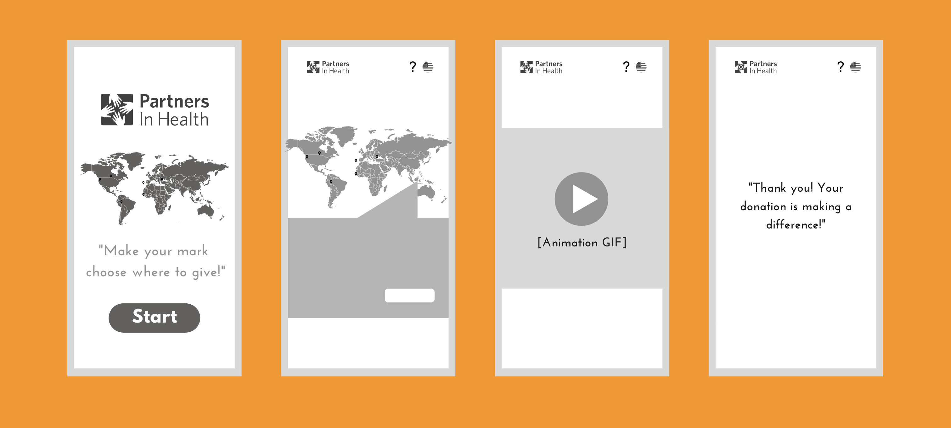
Design Solutions
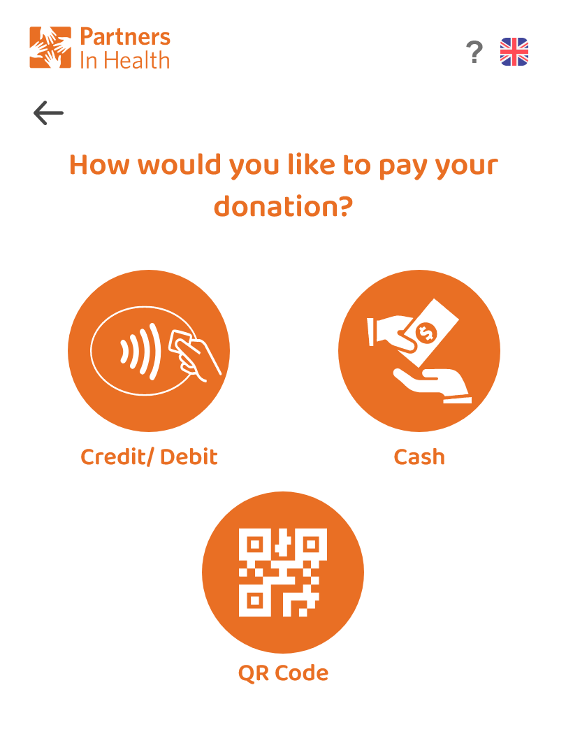
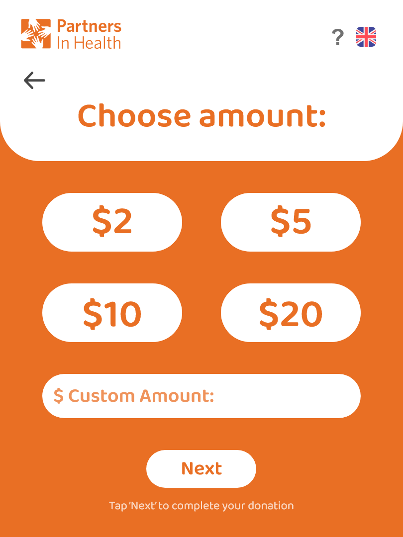
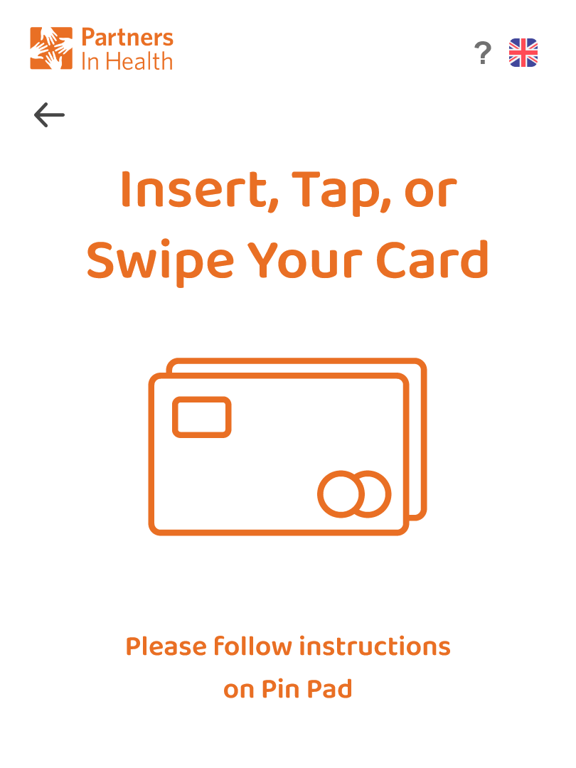
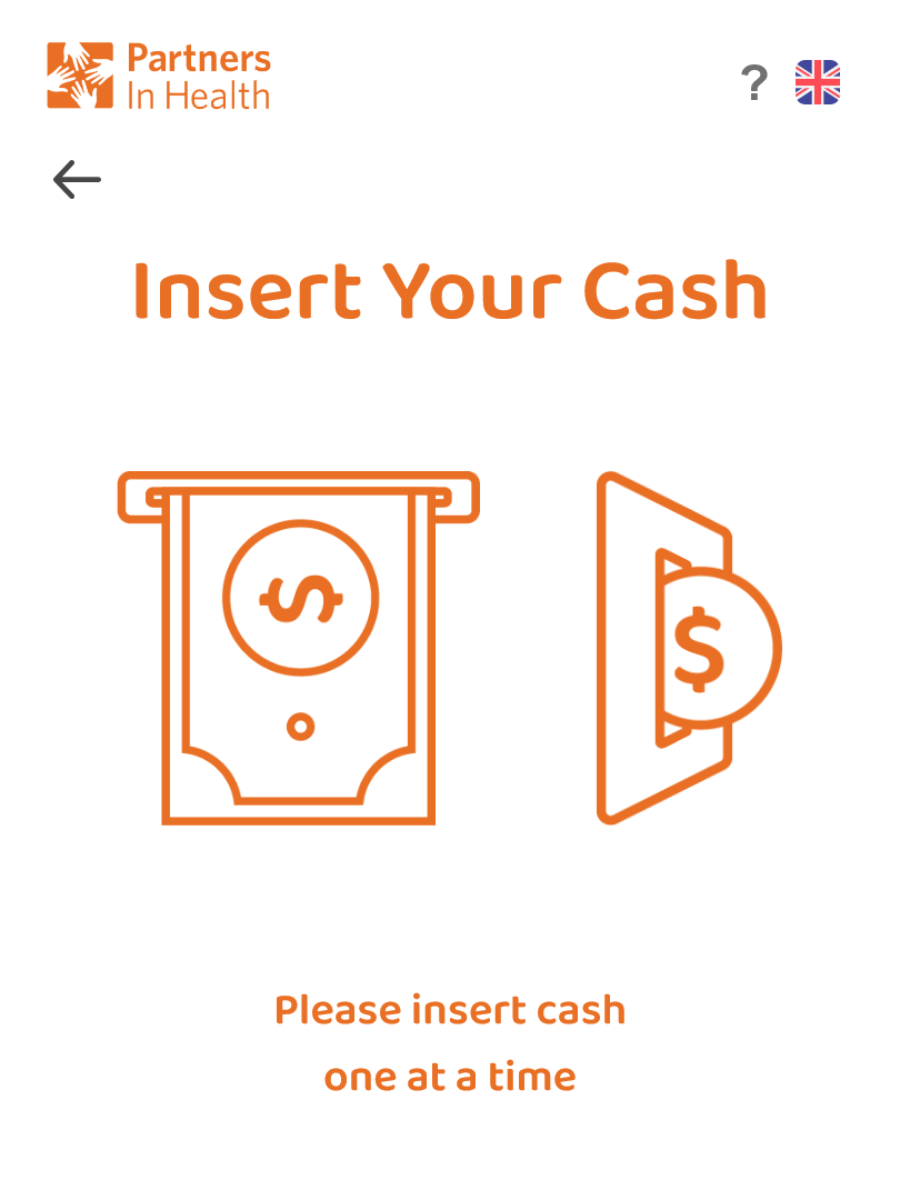
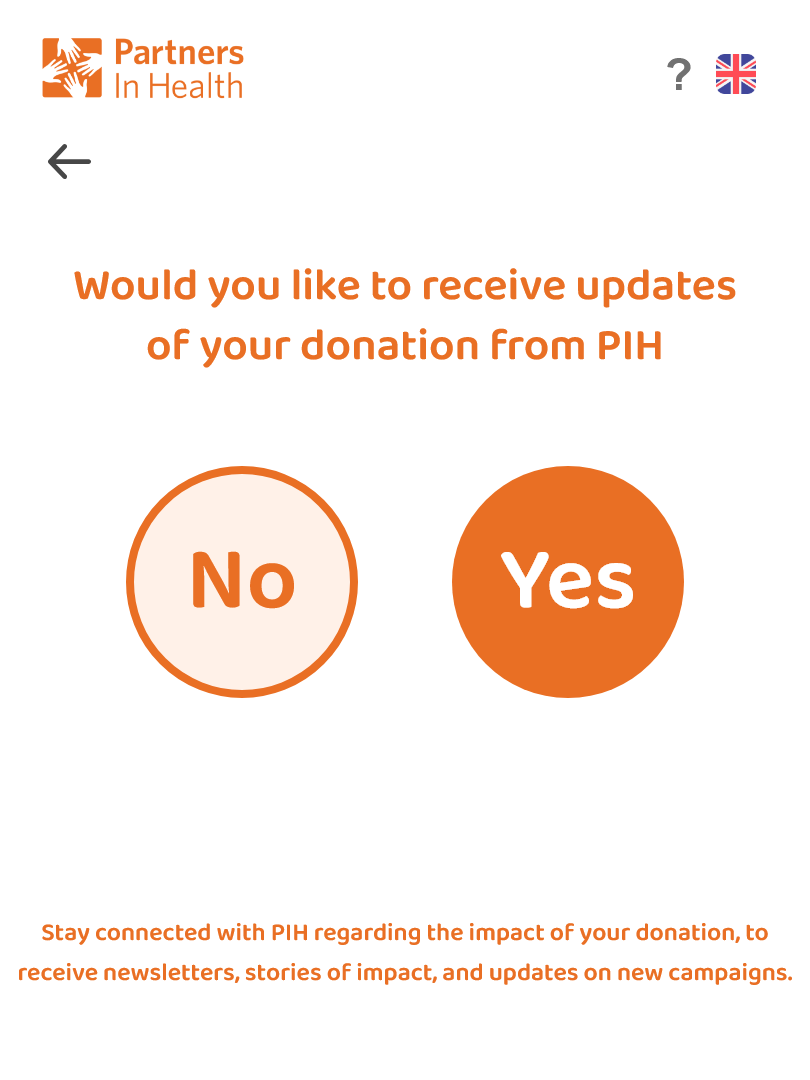
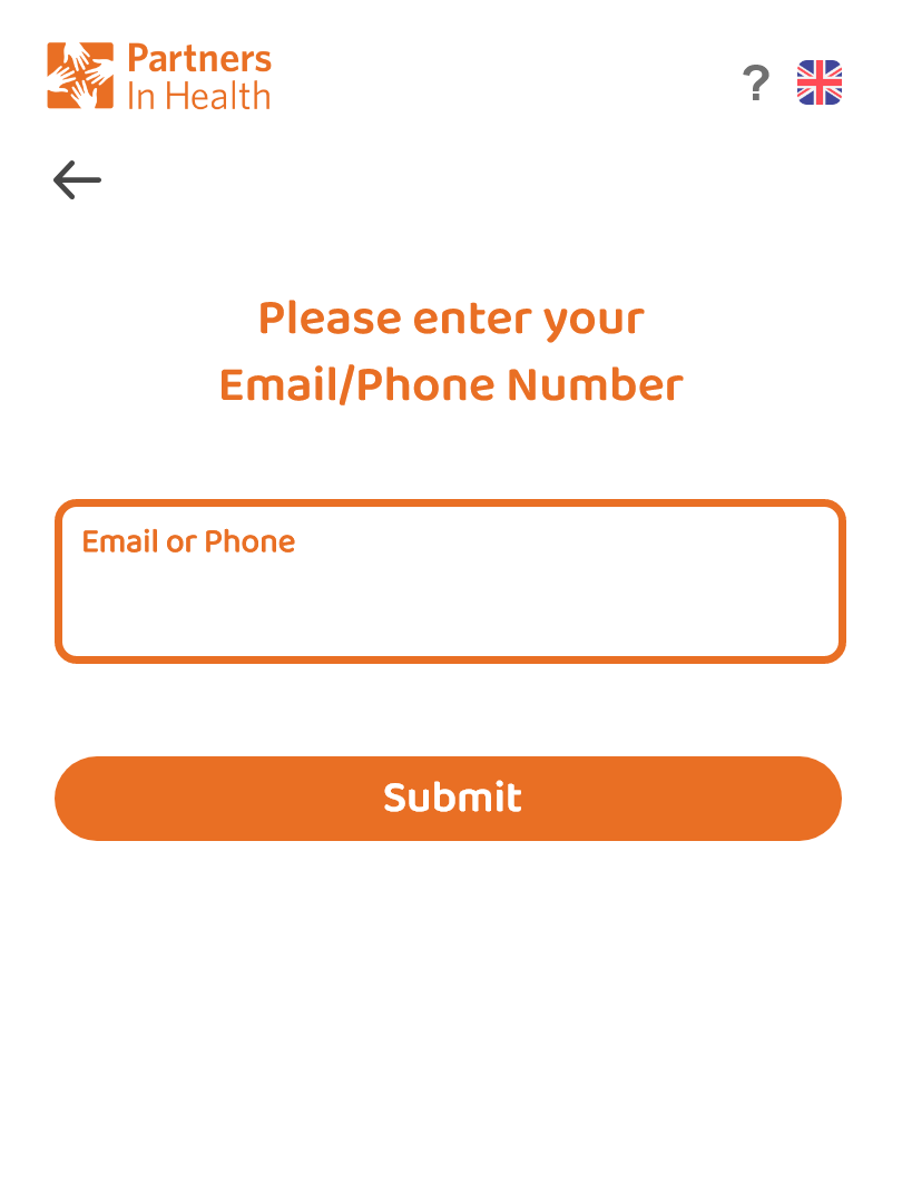
We structured the kiosk flow into three screens: a quick intro, an amount-selection screen with impact-based options, and a confirmation screen with an optional email receipt. Progress indicators and large, high-contrast buttons reduce decision anxiety and keep the interaction feeling light.
- Three-screen flow structure
- Impact-based donation options
- Progress indicators for clarity
- Large, high-contrast buttons
Testing & Iteration
We tested low-fidelity wireframes and later a Figma prototype with 5 participants using think-aloud tasks. Feedback led us to simplify the first screen, reduce the number of donation options, and add a "Tell me more" branch for curious donors without forcing extra reading on everyone.
- Low-fidelity wireframe testing
- Figma prototype with 5 participants
- Think-aloud task methodology
- Iterative simplification based on feedback
Paper Prototypes
Before committing to visuals, we sketched variations of the kiosk flow on paper and ran fast hallway tests. These sketches helped us decide where to introduce PIH's story, how many donation options to show, and how to visually anchor trust elements like logos and security icons.
User Interviews
We conducted interviews with potential donors and PIH representatives to understand donation habits, trust signals, and what would convince people to give in a public transit space. These conversations revealed critical insights about how donors evaluate charitable organizations and what information they need to feel confident giving.
Interviewee 1 emphasized wanting a simple, trustworthy process—clear information on how payment is handled and where the money actually goes before they'd feel comfortable donating.
Interviewee 2 expressed skepticism about whether public donation setups are scams, rarely engages with charity ads, and would want to research an organization's legitimacy and impact before giving.
Key Improvements
Faster path to giving
Reduced the flow from five steps to three, removed optional survey questions, and allowed contact details to be skipped or completed later so donors can give in under a minute.
Impact-first donation options
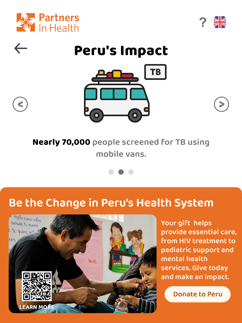
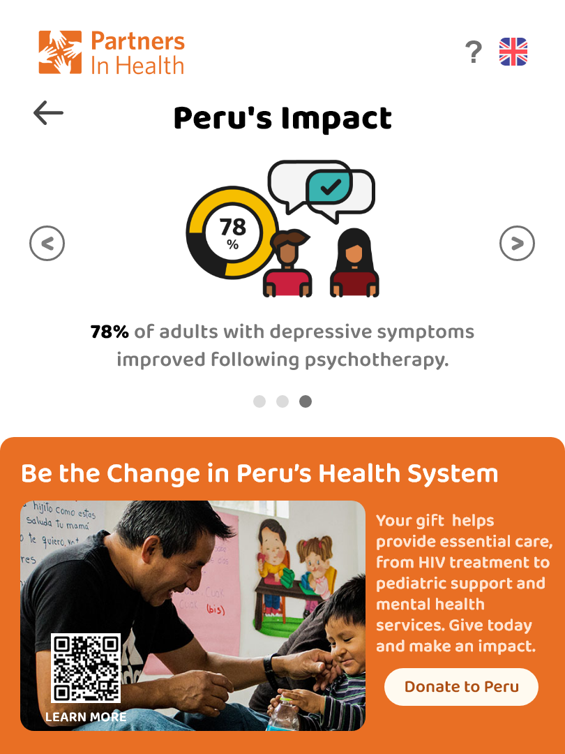
Reframed flat amounts into impact-based choices like "Fund a community health worker for a day," which testers found more motivating and easier to choose between.
Key Learnings
Designing The Giveback reinforced that clarity and restraint are critical when asking for donations in a busy environment. Every extra sentence or UI element competes with trust. I learned to prioritize only the information a donor needs in the moment and to let the kiosk invite, not pressure, people into giving.
Impact
The Giveback prototype successfully addressed trust and transparency concerns that were critical barriers for potential donors. User testing showed significant improvements in donor confidence and engagement with the kiosk experience.
- PIH representatives responded positively to the prototype and highlighted how it could complement their existing online donation strategy
- Studio critique noted improved clarity and emotional framing compared with our early wireframes
- The project strengthened our team's skills in designing for trust, constraints, and physical–digital touchpoints
Final Design


The final prototype brings all the pieces together in a calm, focused interface. The Figma walkthrough shows how commuters learn about PIH, choose an amount, and complete their donation in under a minute while always knowing where their money is going.